How do you create the next chapter of Nielsen Media?
…aka create a new design system and apply it to the Nielsen Media website
The background
(aka introducing the client and the project)
Nielsen Media is a data analytics company. They use 'panels' of real people to measure what people across demographics are watching, listening, and reading. They are best known for their 'ratings' that rank the reach and exposure of TV broadcasts, which has influenced advertising deals for decades.
Following a brand refresh, Nielsen Media partnered with W12 (now TCS Interactive) to translate that new brand into a new experience language that is delightful to use, accessible for all types of users, and generates leads.
The problem
(aka what we heard)
Prior to this engagement, Nielsen Media was expanding beyond TV to offer a wider suite of marketing tools, multi-platform measurement, and content solutions centred around supplying metadata to publishers. However, their existing brand and website were unable to effectively reflect this shift, making it hard for visitors to understand the expanded offering, which contributed to high bounce rates and low leads.
The 'old' Nielsen website
Click on the image to enlarge it. Click anywhere outside the enlarged image to close it.
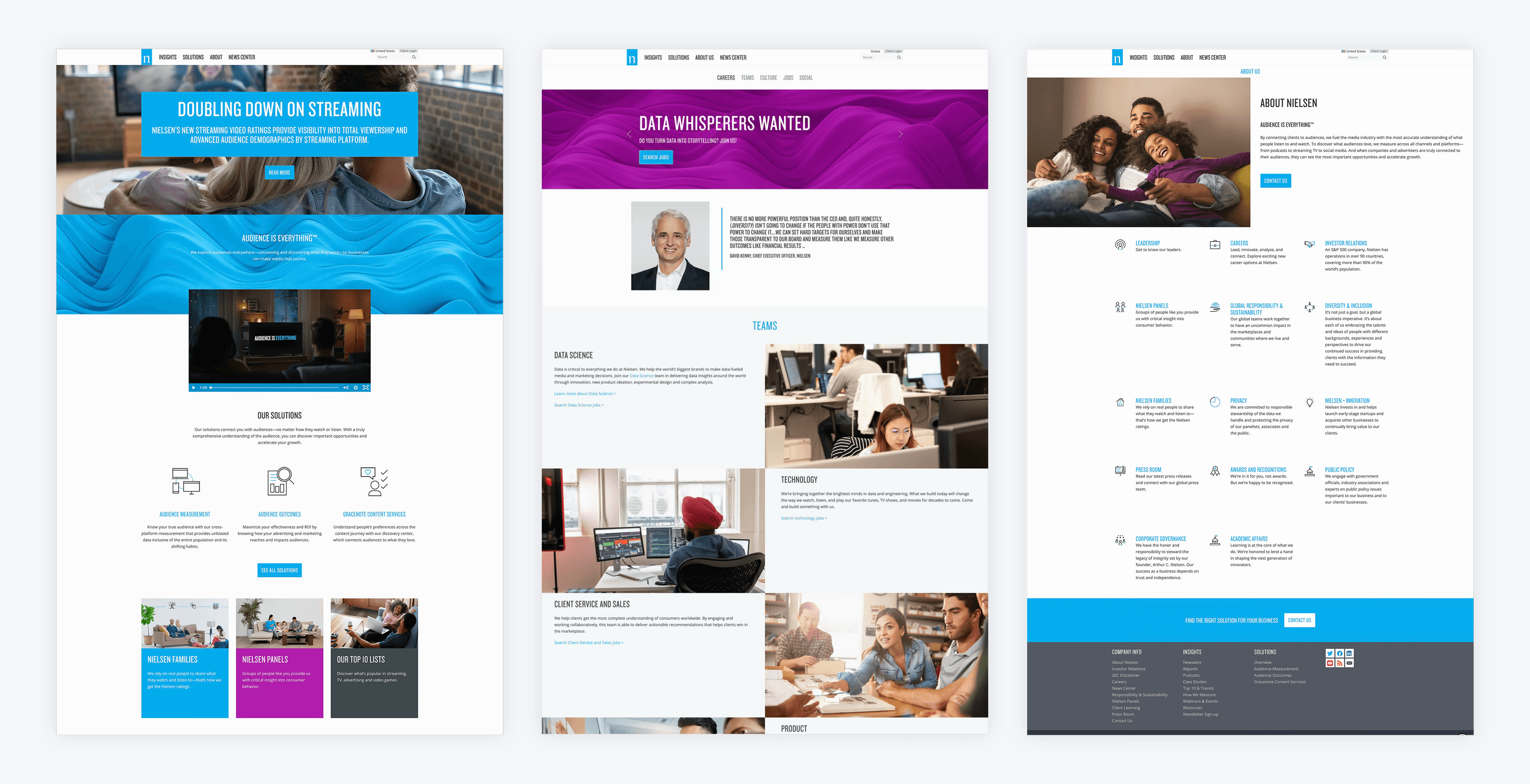
The Nielsen team were also finding it hard to align internally on goals for the website relaunch. There was still uncertainty around who their audience was, how they wanted to be perceived, and what set them apart from competitors.
The approach
(aka what we did to find the right solutions)
This project followed an Understand Context and Make it Real structure.
To kick things off, we conducted stakeholder interviews and multiple immersion sessions around competitors, audience, the existing site and the various products.
Two key themes emerged;
The site structure reflected Nielsen’s internal (siloed) organisation more than the needs of its users, creating unintuitive and confusing navigation.
Valuable content, such as reports, insights, and product information, lacked a clear and consistent hierarchy, making it difficult for users to scan, compare, and find what mattered most.
It also became clear that Nielsen needed more support than expected to shape their new IA and content strategy. But to be fair, there was a LOT to cover. From a large selection of products to a multitude of articles and expert reports, we needed to make that content accessible and digestible to all types of users.
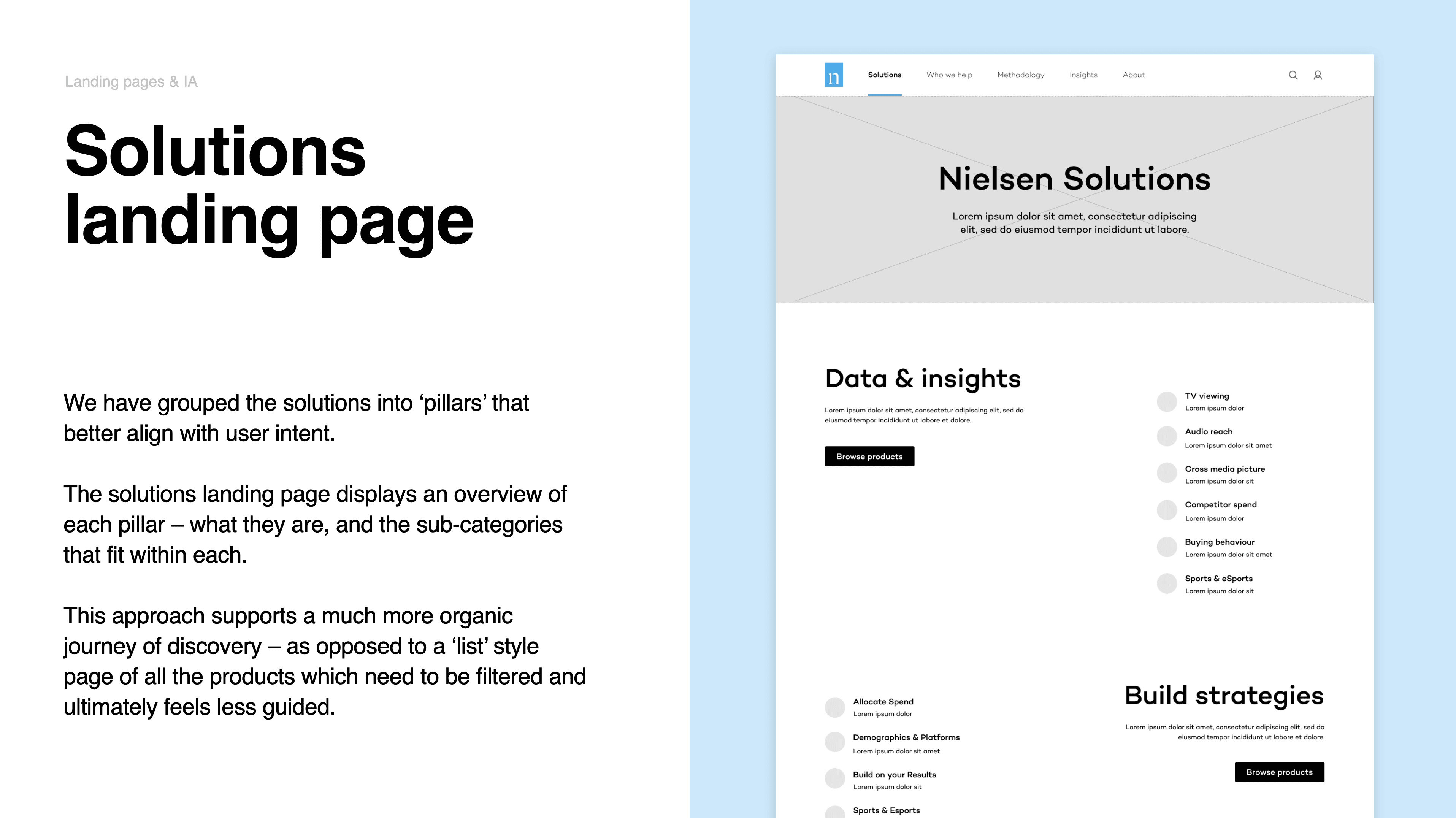
To help get the ball rolling, we shared examples of how we would choose to simplify and group existing content based on what we had heard so far. These examples validated a lot of their internal discussions to date, giving Nielsen the confidence to make some bold decisions.
Example of a proposed IA and content update
Unfortunately, we soon ran into a challenge that would cause issues throughout the project. Nielsen was working with an external branding agency to create their new brand identity. Delivery of those new brand assets was slow and inconsistent. These delays soon affected everything from our initial visual exploration to dev handover and finalising the design system (The final colour palette was handed over two weeks AFTER the site itself had gone live! 🙃).
As we waited on the final brand guidelines from the other agency, we took a calculated risk and started exploring 3 different routes for the website look and feel based on what was available so far. The routes were based on principles we defined in earlier conversations with Nielsen; Human, Clarity, and Data.
Introductions to each route
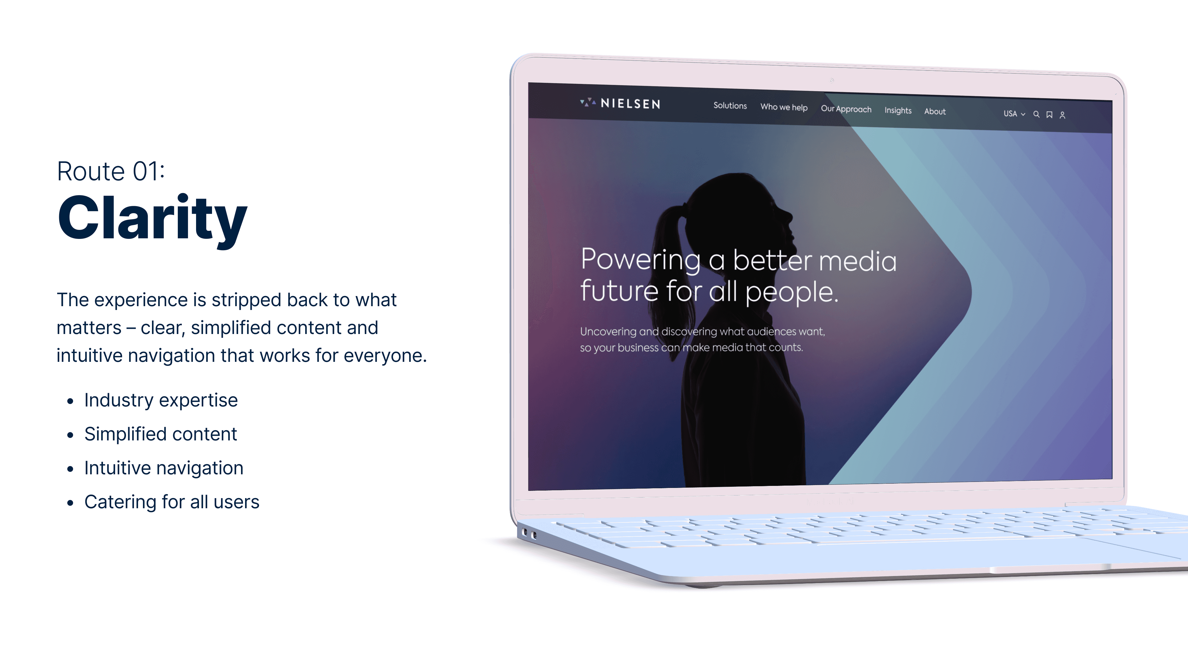
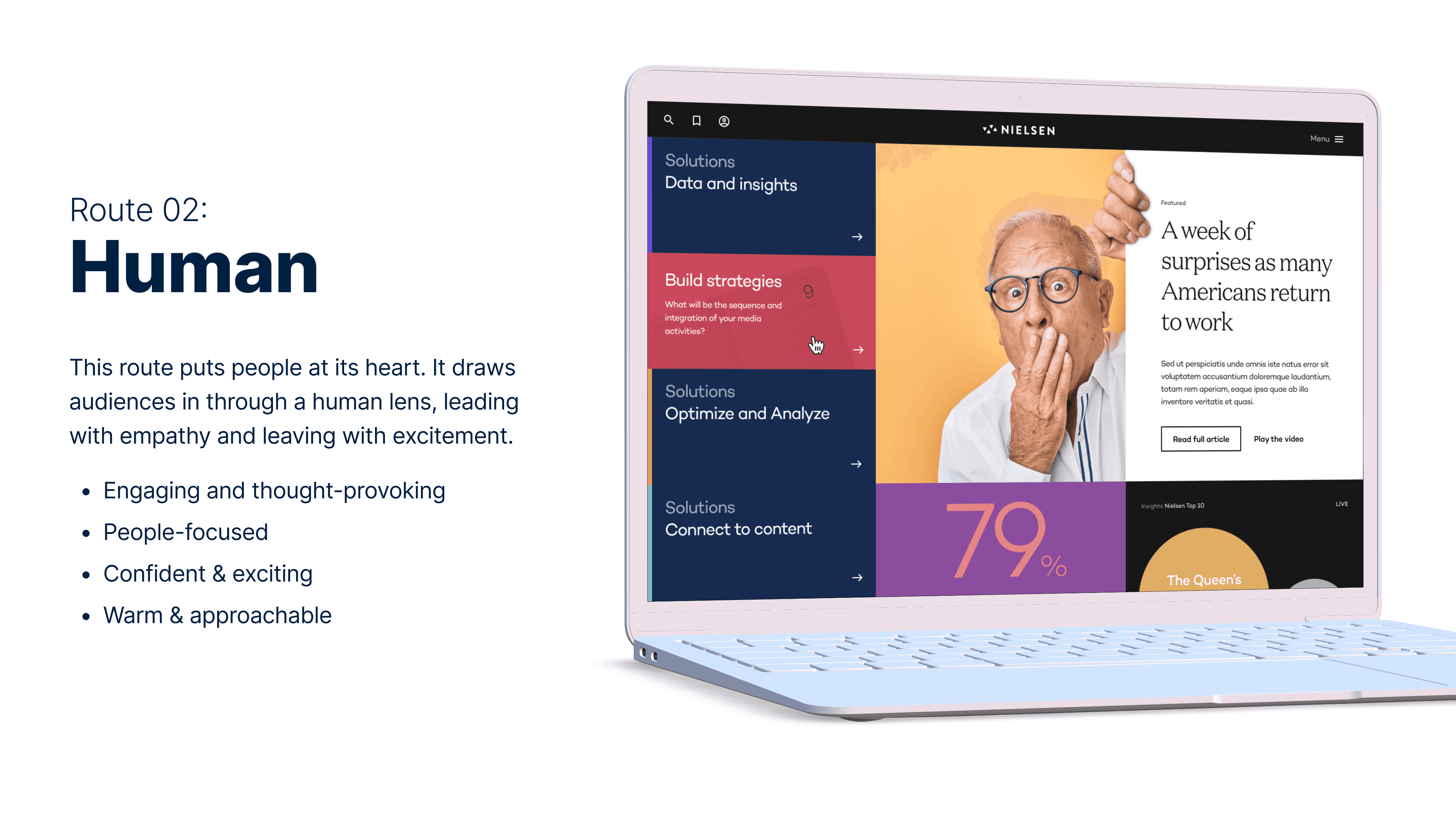
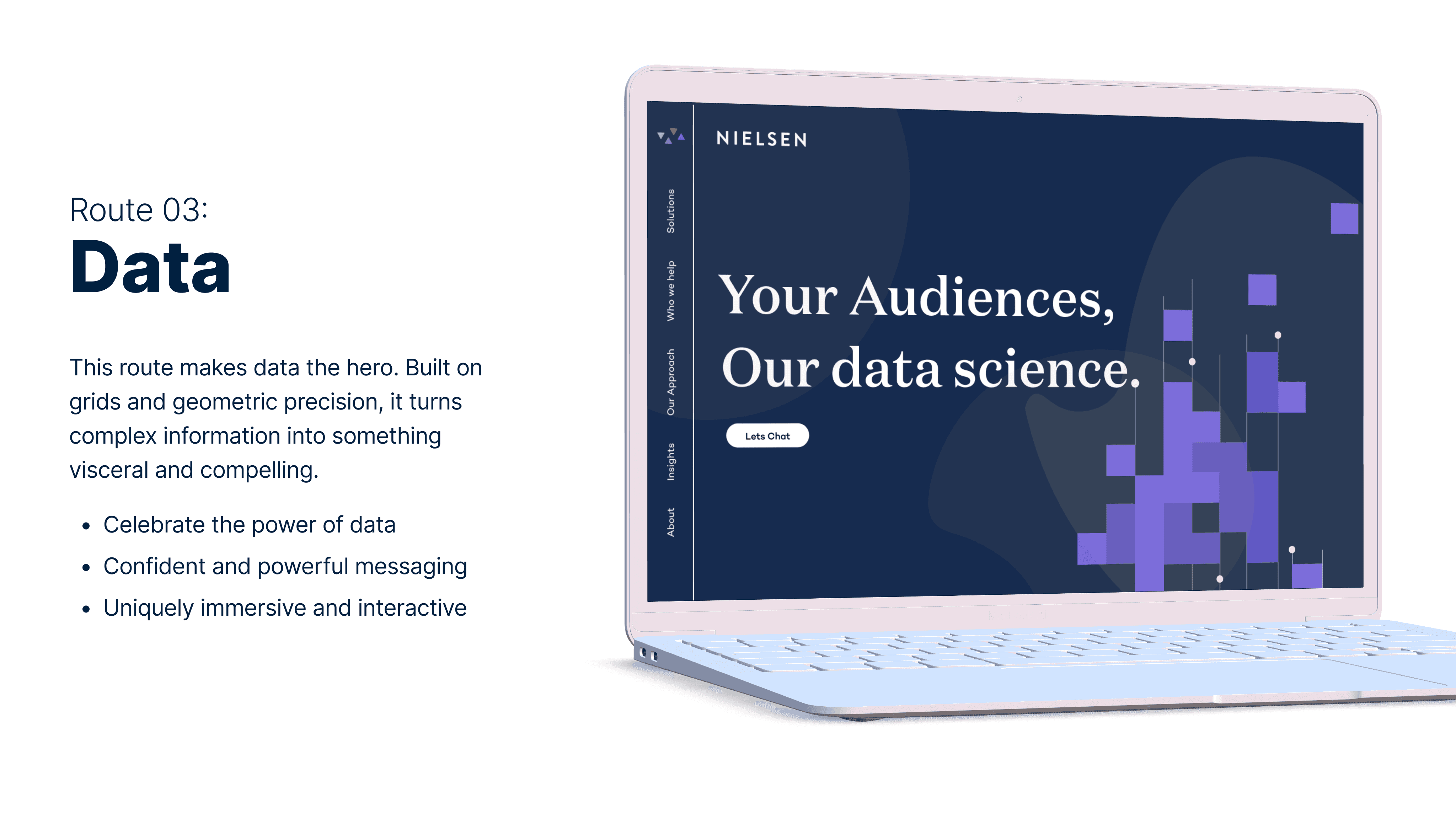
In the end, the client wanted to combine elements from each route, including the photography style, data visualisation approach, and simplicity as an overall principle. Even with the delay in branding, we now had a clear understanding of what the client was looking for visually.
Final look and feel approach
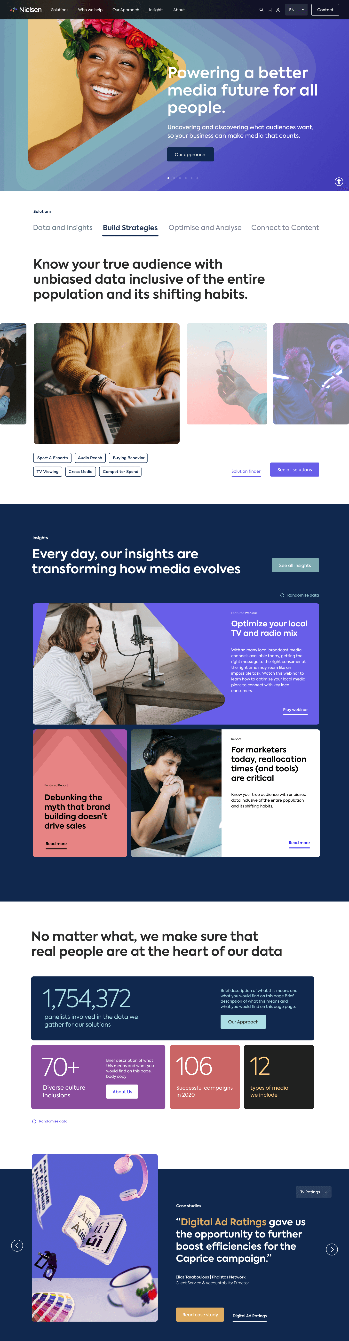
With the look and feel approach signed off, we were able to start building the design system, knowing that foundational elements like colour and typography would change as the final brand assets rolled in. Even though it was a key deliverable, the DS became an invaluable asset when brand delays began affecting the dev build. With rigorous changelog documentation, it helped devs stay on top of component changes affected by the trickling, delayed brand delivery.
But delays actually created an opportunity – add more motion to the DS to bring the new brand to life with little moments of joy and excitement (and actually inspired a further collaboration with Nielsen).

The designs
(aka what we created to make Nielsen.com a delightful, accessible, and lead generating experience)
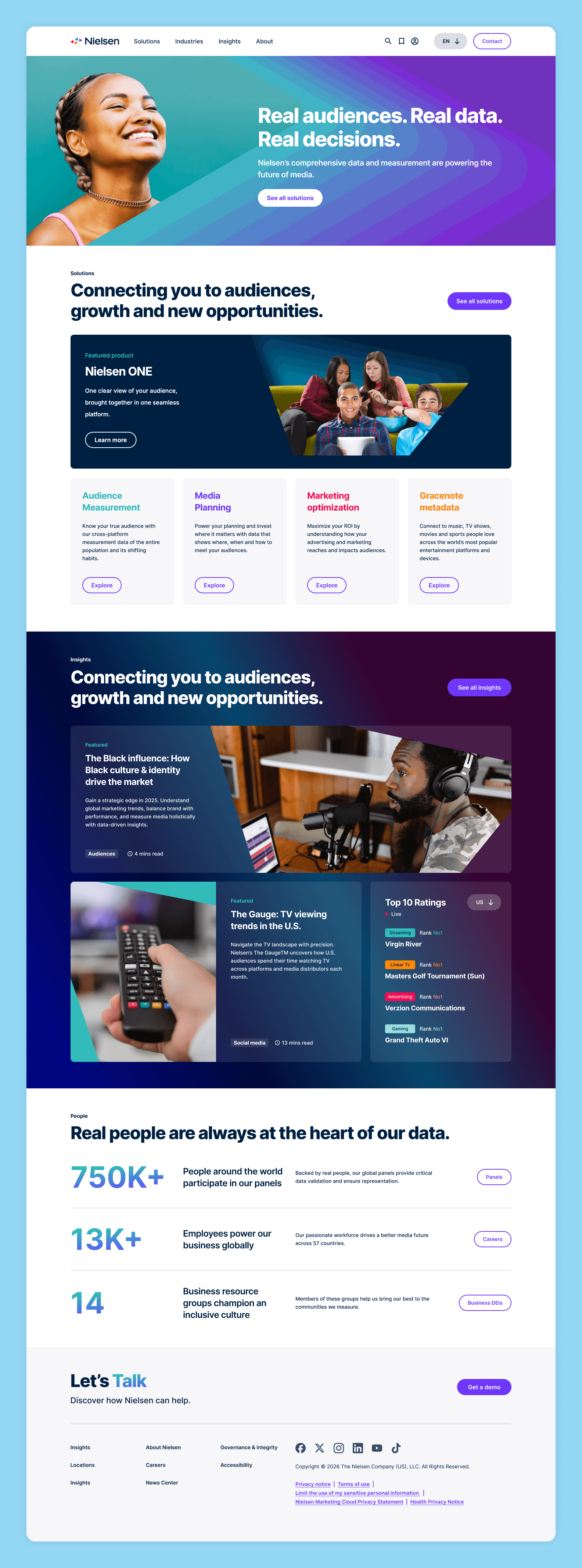
Homepage
The refreshed Nielsen.com homepage makes an immediate impression with it's striking hero, bold messaging and Nielsen's new stepped gradient branding. As the main aim of the site is to generate leads, the design helps users navigate to relevant solutions more quickly through clear categorisation, while insights are introduced in a more engaging way to highlight Nielsen’s expertise.
Solutions – landing page
The solutions landing page gives users a more scannable view of Nielsen’s wider catalogue, helping them better understand what sits where. Organised by category and supported by a unique colour, it's easier than ever for users to orient themselves and explore Nielsen's offerings with more confidence. We also prioritised Solutions in the nav to support the objective of increased lead generation.
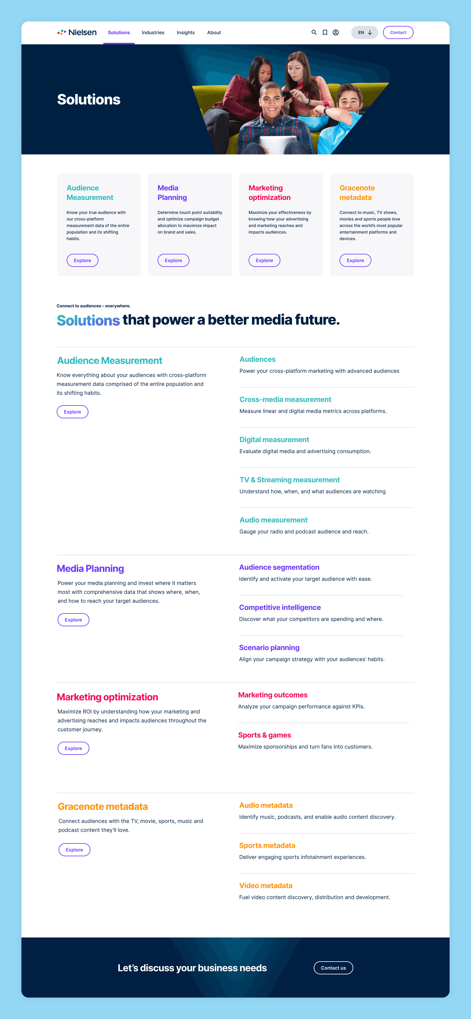
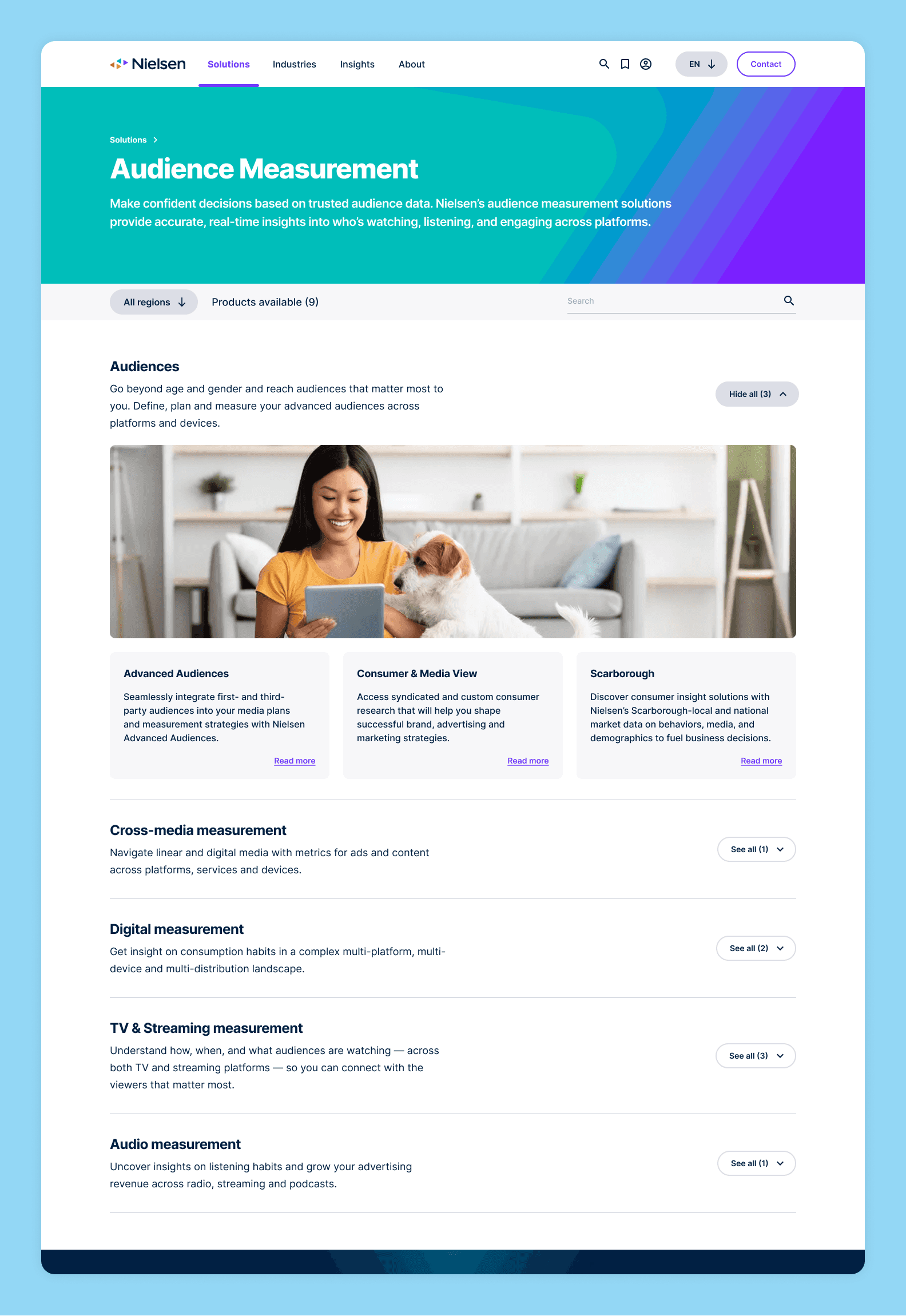
Solutions – category page
This category page was designed to reveal individual solutions progressively, making Nielsen’s wider catalogue feel structured and more approachable. Accordions with label counters support exploration by showing users how much content sits within each sub-category, without losing the context of the broader category offerings.
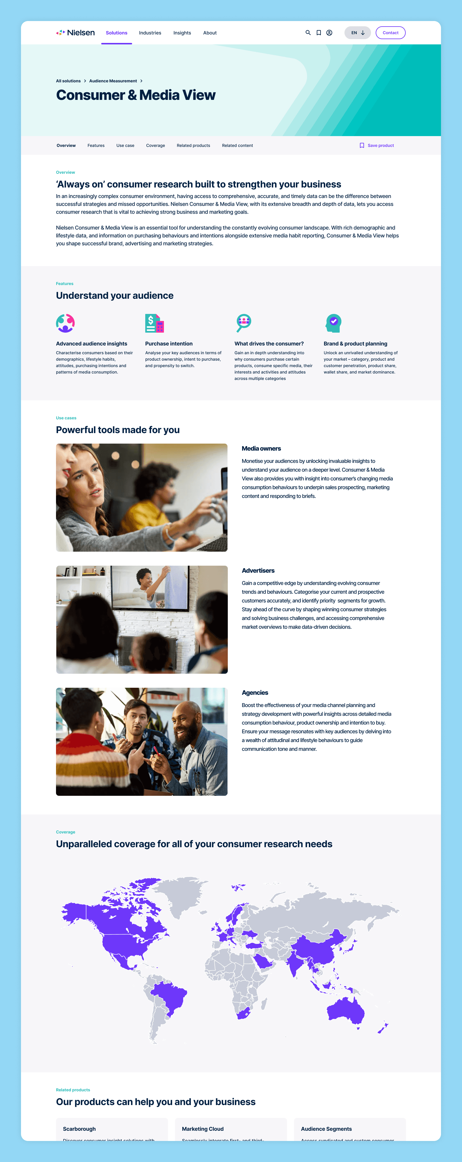
Solutions – product page
Each product page uses a consistent and easy-to-follow structure, giving users a clear understanding of the product while allowing flexibility for more specialist content where needed. The template introduces the product through a concise overview, key features, use cases, and related content – with space between use cases and related content available for product-specific unique content.
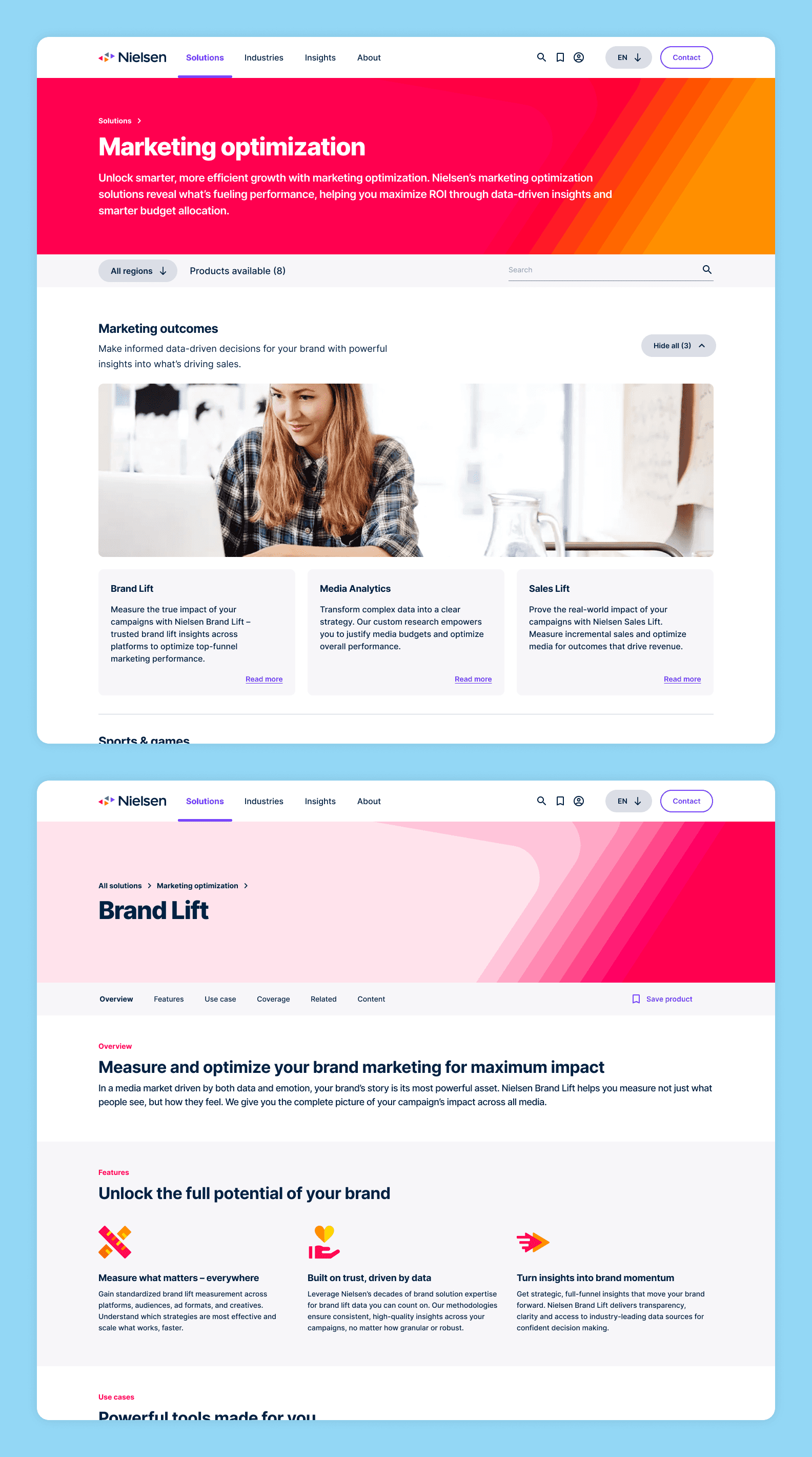
Solutions – example of alternative category colour
Audience immersion sessions showed that users were often confused when browsing Nielsen’s sub-categories and individual offerings as they could appear similar without more context. To make exploration easier, each category was given a unique colour to help users orient themselves and explore with more confidence.
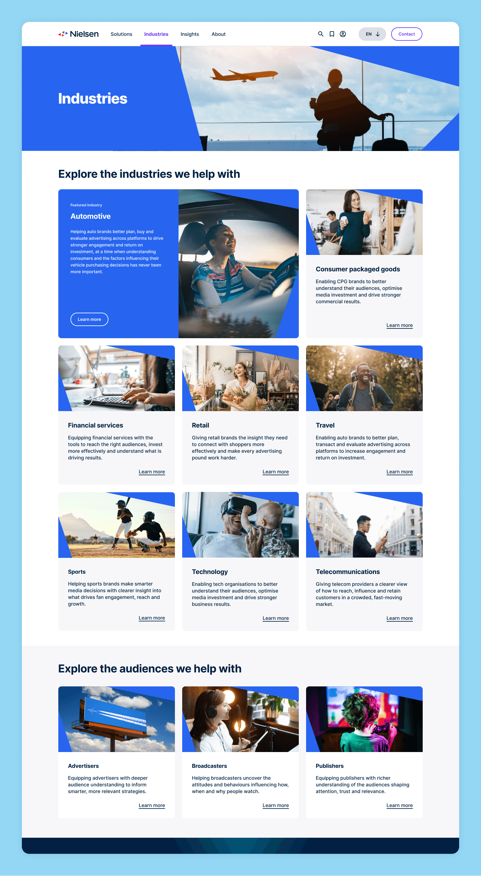
Industries landing page
Research from the immersion sessions highlighted that users found it difficult to map Nielsen’s solutions to their own business objectives. In response, a new section was introduced to show how Nielsen can support different industries, providing an alternative path by helping users explore solutions through a lens that felt more relevant to them, while keeping the main call to action focused on booking an introductory call to generate more leads.
Insights landing page
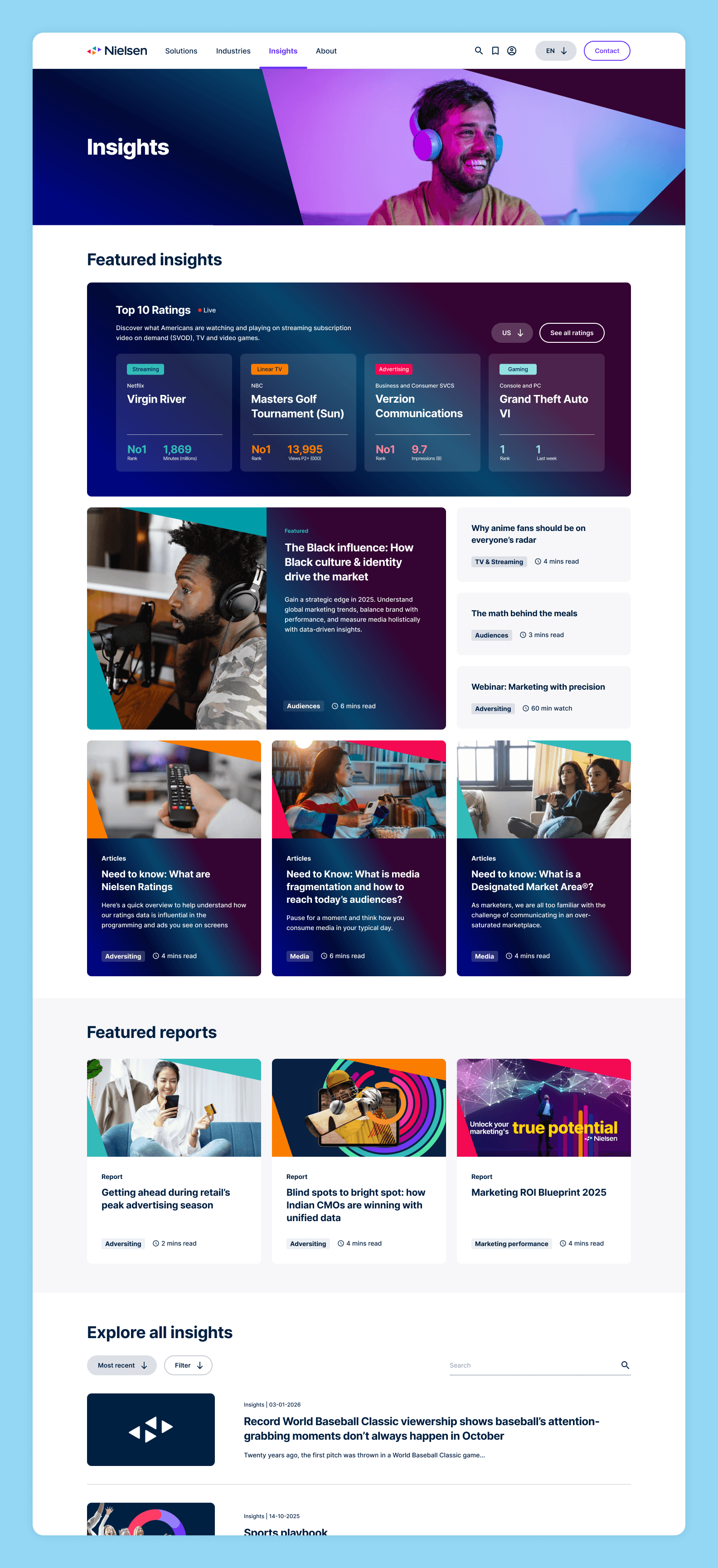
Nielsen is a leader in audience insight, underpinned by robust data and analytics, but the previous experience felt closer to browsing static documents and slide decks than exploring expert content. The redesigned experience makes insights more engaging and easier to browse, with tagged, featured, and filtered content helping users discover relevant material, alongside a distinctive screen-like gradient that nods to Nielsen’s legacy in television ratings.
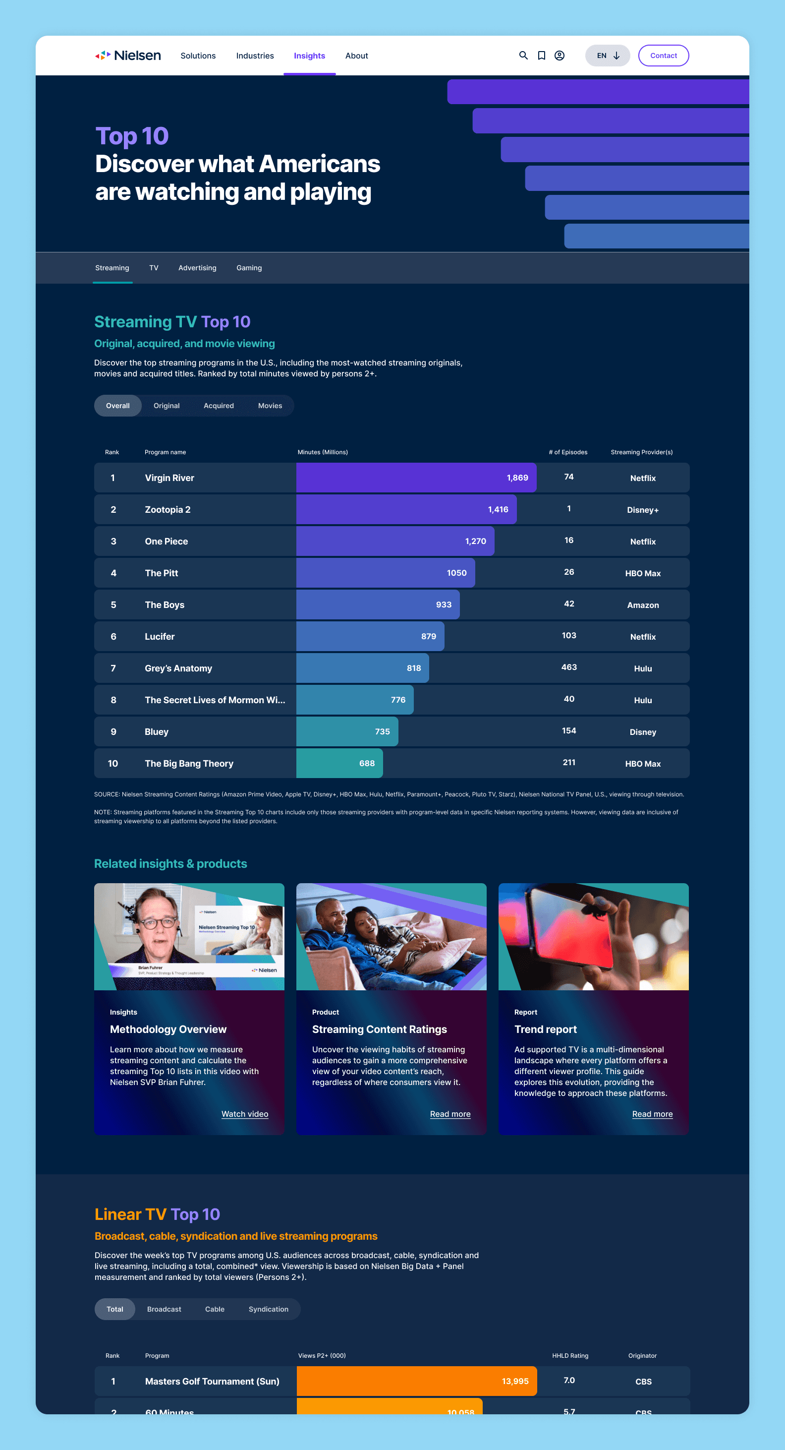
Insights - top 10 data
That distinctive visual style carries through the entire insights experience, helping present data in a way that is both visually engaging and easy to understand for a wide range of users. The result is a more modern and confident experience that truly defines the next chapter of Nielsen Media.
The insights
(aka what we learned and what we'd do differently)
At the time, Figma was new to most of the team and key features like prototyping and tokens were very much learnt on the go. A lot would be done differently with the knowledge we have today.
Having a separate Kanban board for just the design system made it easier to manage the delayed brand elements and impact it had on components. It also fed directly into the wider changelog document.
On reflection, a prototype kanban/changelog would have also made it easier to track updates and fix issues when they arose post-handover.
Organising regular team retros helped improve overall moral and improve ways of working. It brought the team closer together and made sure that everyone had a voice.
Sometimes cheekily jumping the gun is the best way to help a client make decisions. Nielsen found it much easier to collectively react to something ‘real’ than brief us on what should go on a blank page.
Some clients really dislike Llorem Ipsum placeholder content, but there are many Figma plugins (and AI tools) that can provide alternatives while waiting on final content being provided by the client.
The impact
(aka what our work achieved and how users reacted to it)
The TL:DR
(aka when you're very busy or don't like long pages)
Goal: Refresh Nielsen Media’s digital experience with a new design system and website that better reflected their evolving offer and supported lead generation.
Problem: Nielsen had grown far beyond TV ratings, but the website did not reflect that shift. Users struggled to understand the wider offering, bounce rates were high, leads were low, and internal alignment on content, audience, and structure was still taking shape.
What we did: We ran stakeholder interviews and immersion sessions across audiences, competitors, products, and the existing site. From there, we helped shape the IA and content strategy, explored new visual directions, and worked on the website and design system in parallel to keep things moving despite delays to the final brand assets.
Solution: We created a more engaging, accessible website and a flexible design system that made Nielsen’s wider portfolio easier to explore and understand. The final output included a new IA, 16 new page templates, and a comprehensive design system, all designed to bring the refreshed brand to life in a more modern and confident way.
Impact: The new experience helped reduce bounce rate by 40%, increase average visit duration by 3.5 minutes, bring in 500k more annual visitors, and drive 3 more pages per visit. It also landed really well internally, with strong feedback from stakeholders across Nielsen.
Key lessons: Sometimes showing something tangible is the fastest way to build alignment. Running the design system as its own workstream, with clear documentation and changelogs, was key to handling moving content and delayed brand delivery.