How can Nest redefine workplace pensions for its millions of members and employers?
…aka transform the Nest experience to drive engagement, create better outcomes for members, and make things easier for employers.
The background
(aka introducing the client and the project)
Nest (National Employment Savings Trust) is an online pension scheme set up by the government in 2011 to make sure that every UK employer can offer a workplace pension to their workers. Every UK employer has to put eligible workers into a ‘qualifying’ workplace pension and contribute towards their retirement. It’s Nest’s goal to make pensions as simple as possible for their 13 million members and 1 million employers.
TCS have partnered with Nest since 2011, providing IT, customer service, and operational support. After a failed engagement with another design consultancy, Nest asked TCS to extend that partnership to improve the member and employer experience, which is how TCSi became involved
The problem
(aka what we heard)
The current Nest experience is limited and frustrating. The public-facing website and the logged-in experience are disjointed experiences, creating usability issues. The TAW also looks and feels outdated, making tasks harder than they should be. Without enough contextual help and support, users end up reaching out to the call centre or abandoning tasks altogether.
For members, many have little awareness of Nest or that they’ve even been enrolled in a workplace pension. This leads to member inaction, increased opt outs, and an overall negative perception of Nest. The online reviews speak for themselves!
For employers, they often find the initial setup challenging, particularly when it comes to understanding responsibilities and eligibility rules. Managing employees can also become time-consuming when spreadsheets or payroll exports don’t match the very rigid formatting requirements, resulting in vague errors and manual workarounds.
The approach
(aka what we did to find the right solutions)
This project followed the standard W12 project structure of Understand Context, Create a Vision, and Make it Real phases.
Example slide the heuristic review playback
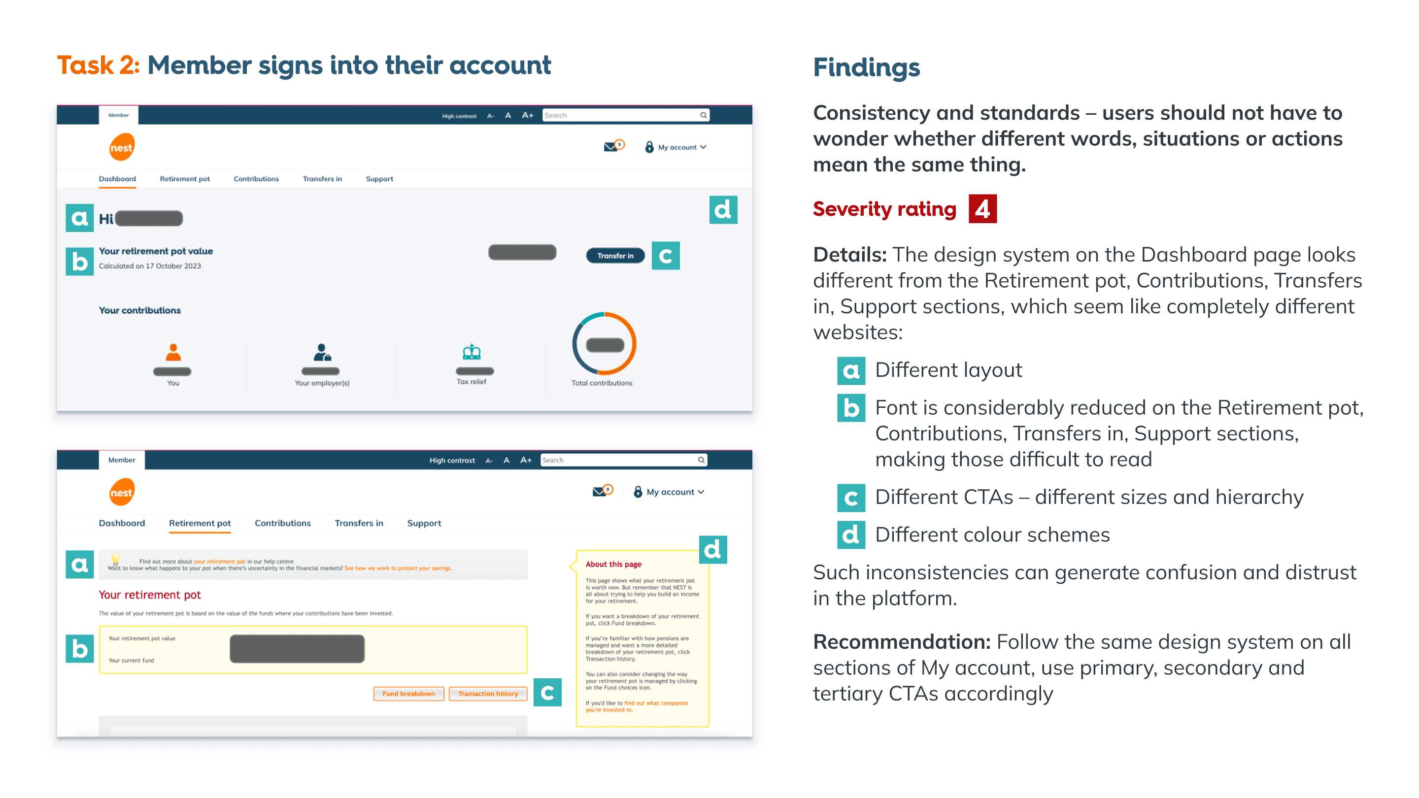
We reviewed both pension competitors and analogous digital experiences to understand what “best in class” looks like today. That broader benchmark helped us reinforce a key point with the client: people don’t lower their expectations just because they’re managing a pension, they expect the same quality and ease of use they get from any best-in-class digital experience.
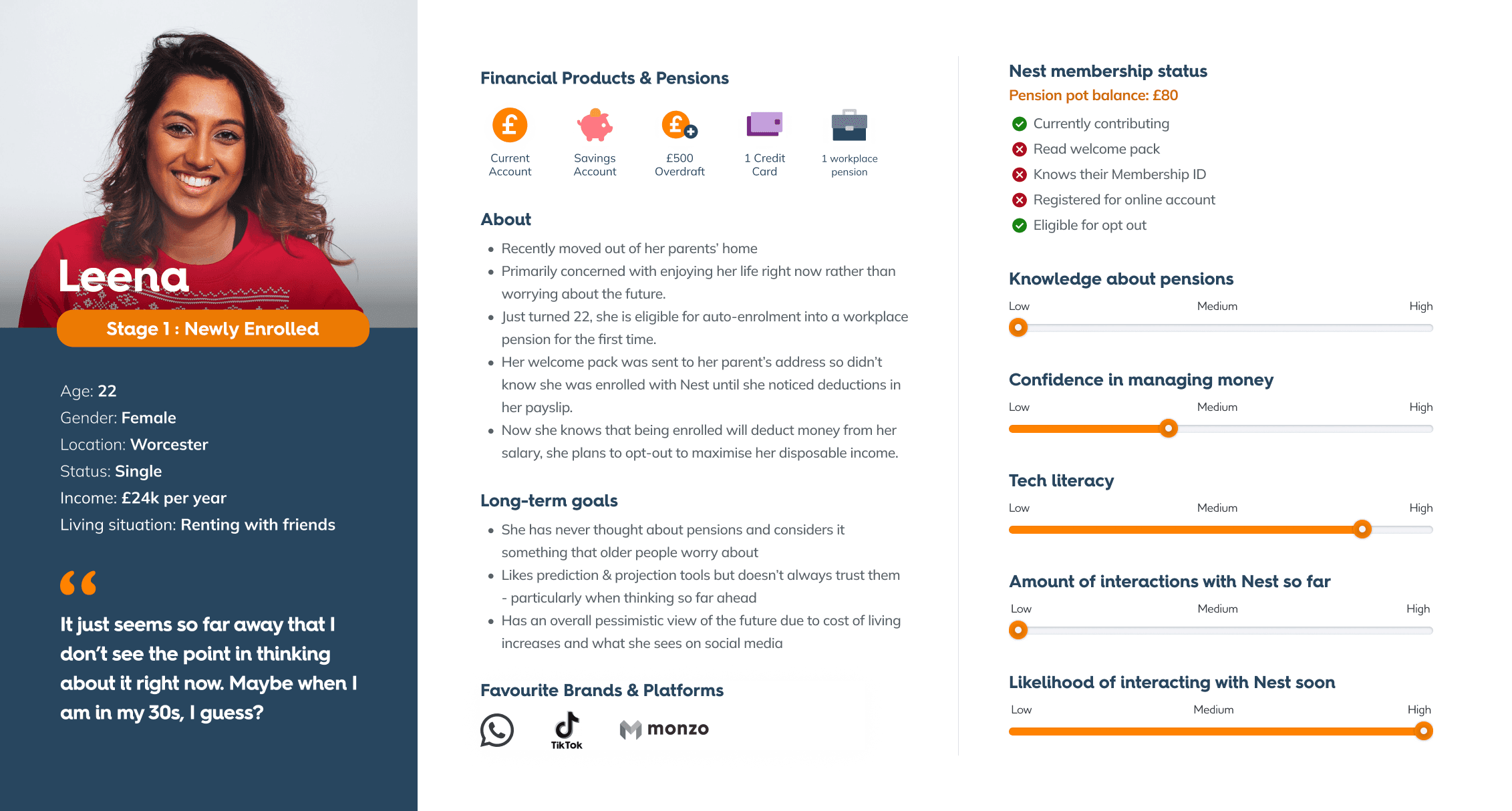
As the final activity for this phase, we developed a series of personas for employers and members. We used these personas to guide our strategy and design decisions throughout the engagement, keeping real user needs at the centre of everything we did.
Example of a Nest member persona
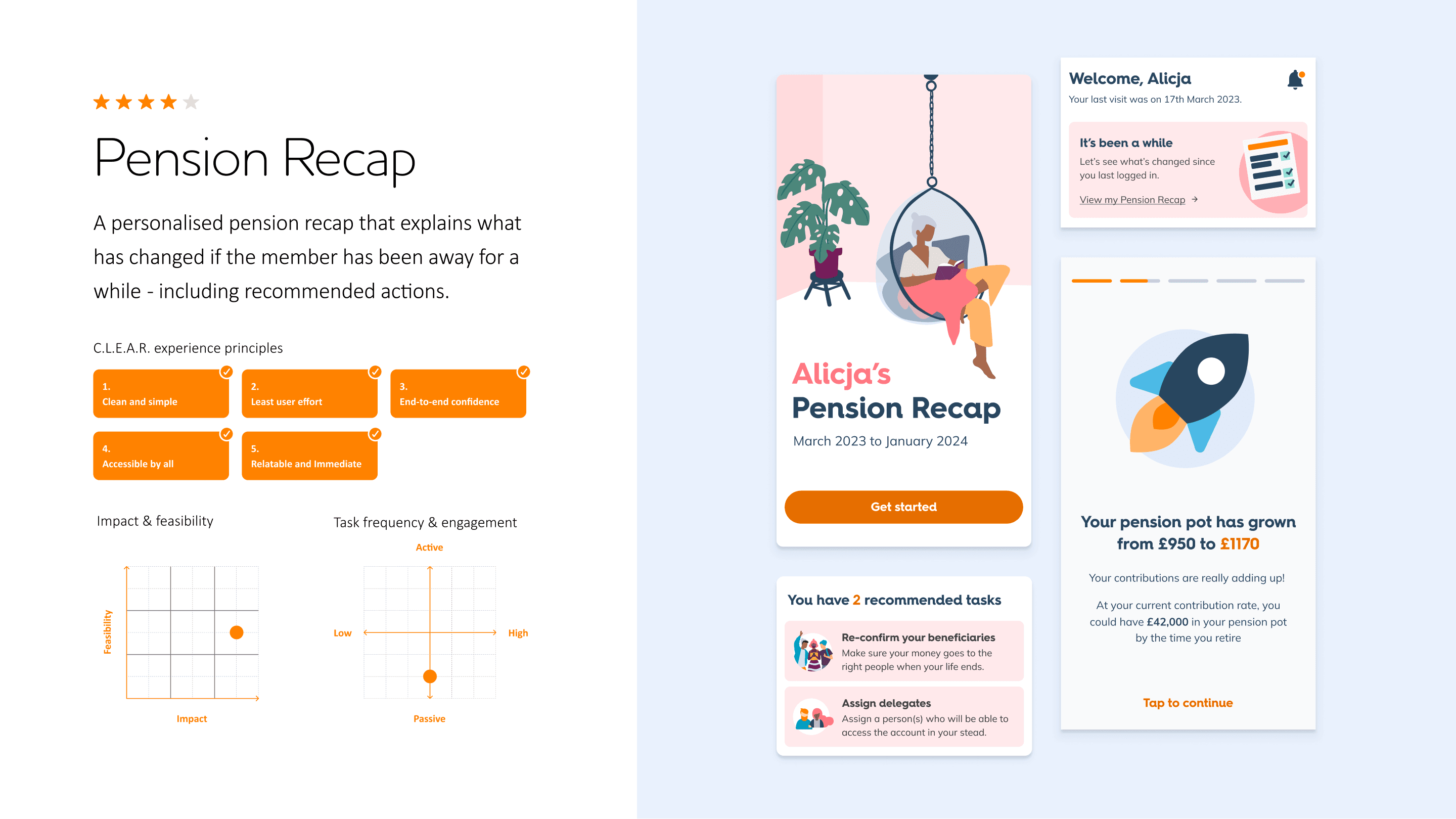
Example of a member concept slide
Example of a employer concept slide
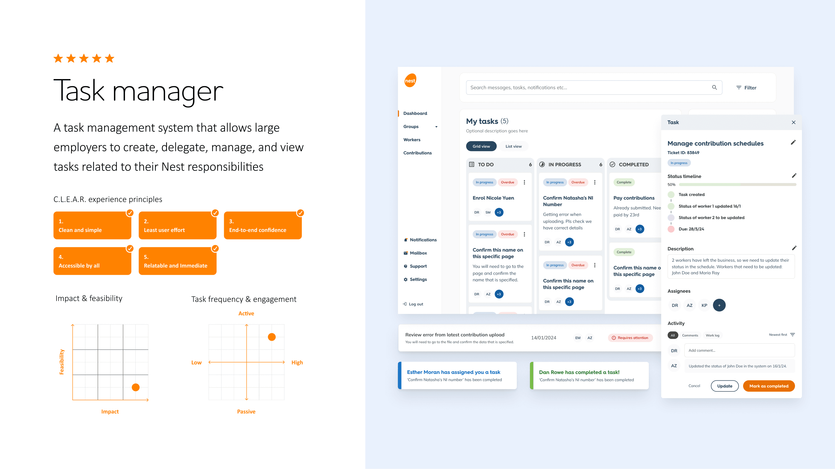
Because Nest were scared of repeating past mistakes, we were asked to test the vision concepts before moving forward. Overall, the feedback from this round of user testing was positive and confirmed we were on the right track. It helped us fine-tune a few things around language and getting users to their end goals quicker, and prioritise which concepts we should take forward.
But… and it's a big BUT. There was one final hurdle we had to clear first. Given past experiences, Nest needed reassurance in the form of a clear, thorough, and easy-to-circulate framework that removed all doubt about who was doing what, when, and why. This document mapped out how an agreed way of working would scale across multiple large, cross-functional teams. We actually began working on this prior to kick-off but updates continued throughout the first two phases of the project.
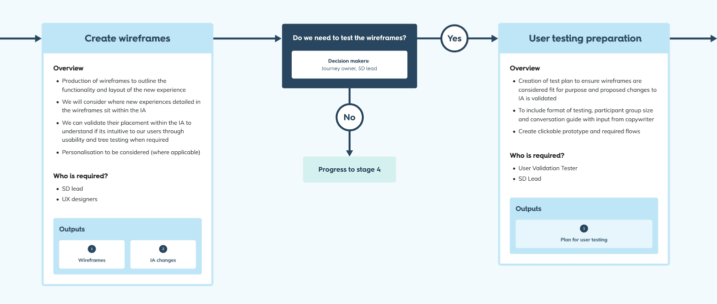
The result was a Service Design Methodology (SDM) process flow created in Figma. It provided a clear visual diagram of the five delivery stages, outlining every activity, requirements, dependency, decision point, and owner. Creating the SDM was a project in itself, but it was worth the extra sweat and tears. It kept the JSTs aligned, provided traceable accountability, and gave us an easy way to course-correct whenever work or scope started to drift. Click here to view full SDM. (May not load in Safari).
JST 1
Transform the Nest digital experience for members
JST 2
Transform the Nest digital experience for members
JST 3
Stylistic updates (without changes to functionality)
JST 4
Transform the Nest digital experience for employers
Work for the members experience was divided into ‘chunks’ and split between JST 1 and 2. Example chunk scope include managing beneficiaries, managing member details, and opting out. Myself and a Service Design Lead sat across JST 1 and 2, taking responsibility for the UI and UX, respectively.
Building on outputs from UC and CAV, each JST focused on doing a deeper audit of the existing experience, defining what wasn’t working, how we could improve it, and what requirements the new experiences needed to deliver. Each JST conducted regular user testing per chunk, validating the new experience and identifying further room for improvement.
Bonus round: the Design System
Alongside the JSTs, we formed a dedicated Design System team to build a new DS in Figma. That team created a reusable component library with an updated look and feel, backed by clear guidelines and annotations to keep design consistent across the product. I oversaw this DS work, which meant I eventually became involved across the work of all four JSTs – not just the two I originally sat with day to day.
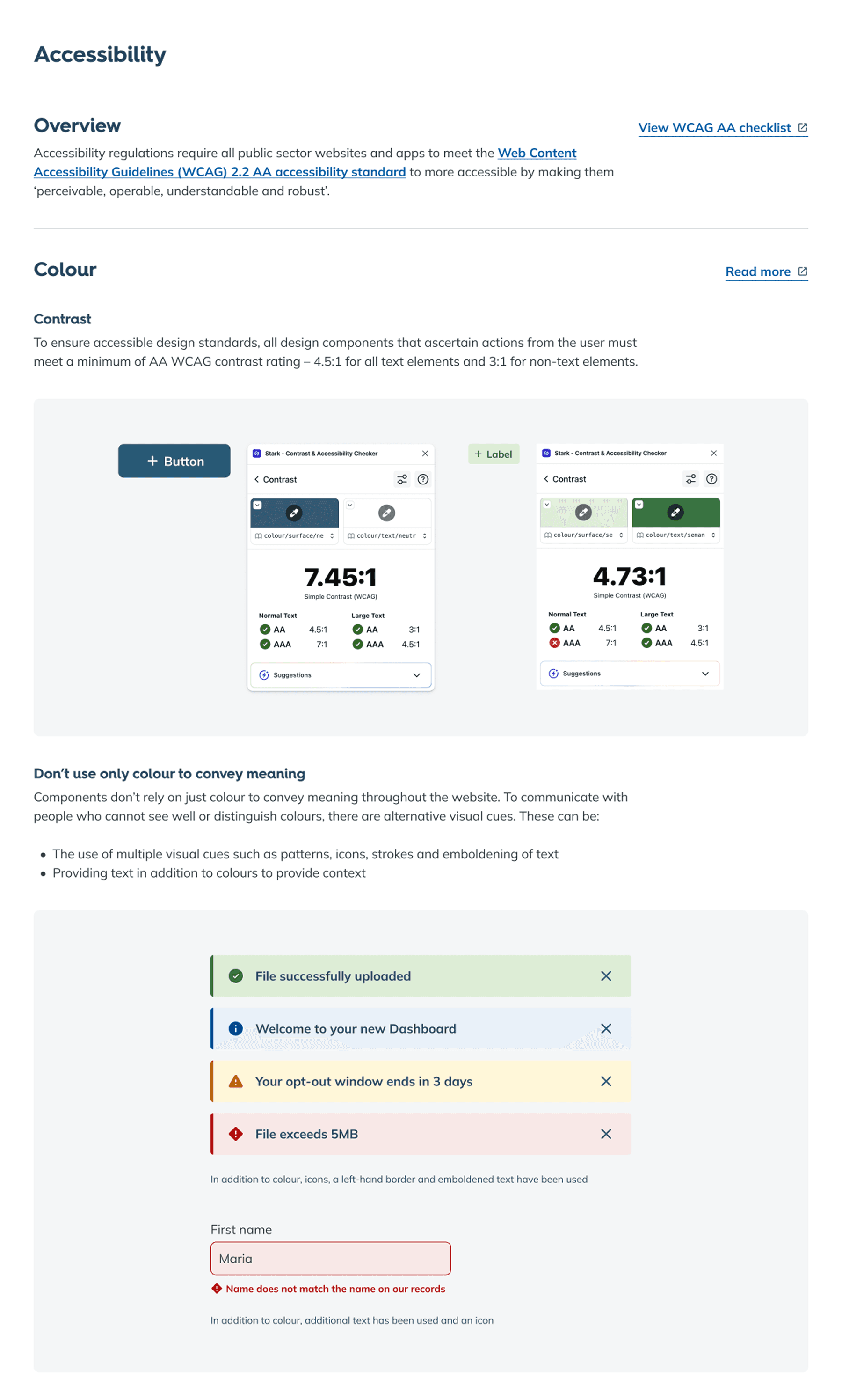
But the design system was about more than visual consistency. As a public-sector service, Nest needed to meet the WCAG 2.2 AA accessibility standard. To make that achievable at scale, we baked accessibility into the foundations of the design system and applied it consistently across every component and pattern. That’s also why the documentation had to be thorough but easy to follow, so anyone could understand the accessibility-driven decisions without relying on endless notes, meetings, or presentations.
Excerpt from accessibility guidelines
To keep the Design System work moving smoothly across JSTs moving at different speed, we created an SDM-like governance process just for the DS. It included a tracker to capture every component request, how to define its priority, the owner, status updates, and how to capture existing designs, decisions, and documentation. We also set out a comprehensive stress test process so components and their guidelines could be approved with clear checkpoints for design quality, accessibility, and build readiness before anything was marked as “signed off”.
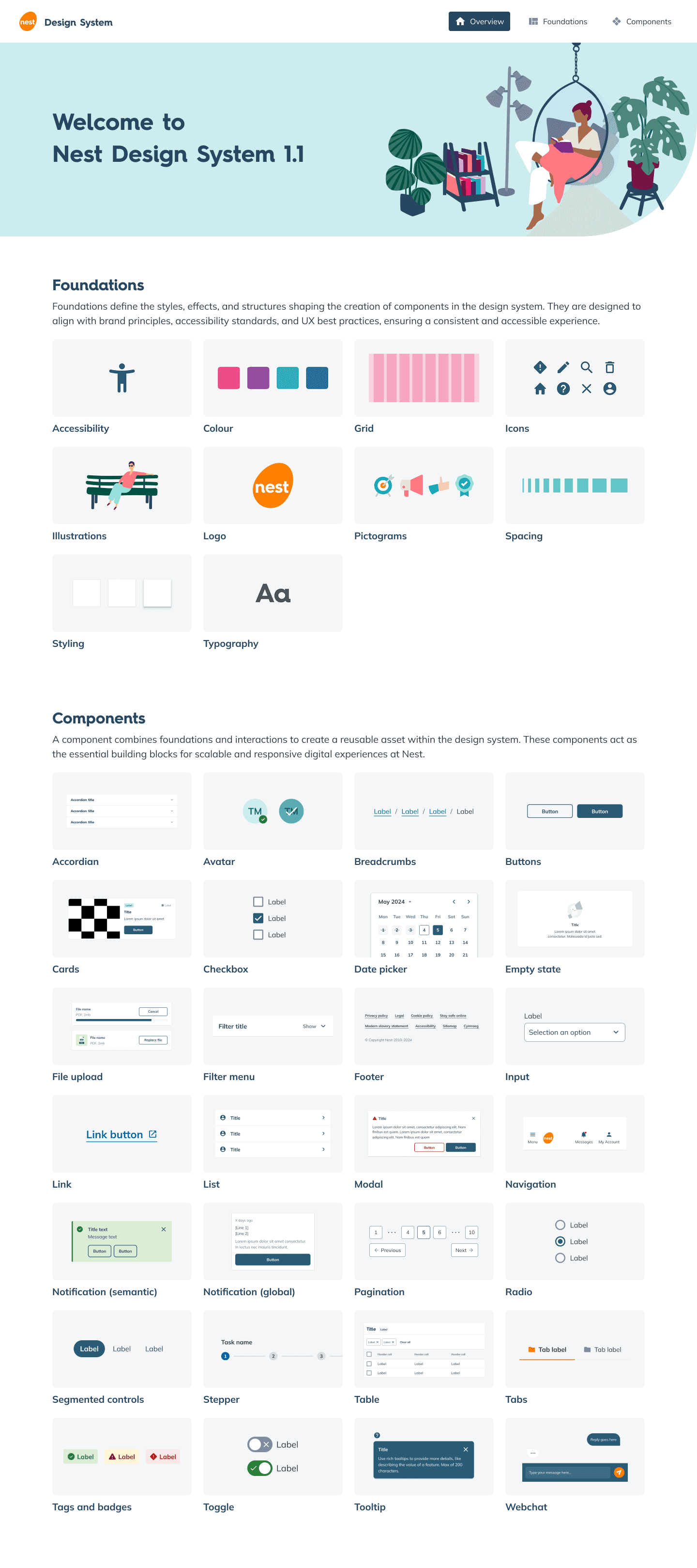
In the end, we launched v.1.0 of the DS with the following;
28 new components
Brand new icon and pictogram library
Refreshed colour palette
Redesigned typography styles
54 pages of guidelines and documentation
Full compliance with WCAG 2.2 AA requirements.
Contents cover page of the Nest design system
The designs
(aka what we created to make things more engaging for members)
Beyond the DS, I had no overview/input into the employer experience, so I will only be including designs for the member experience.
Members' dashboard
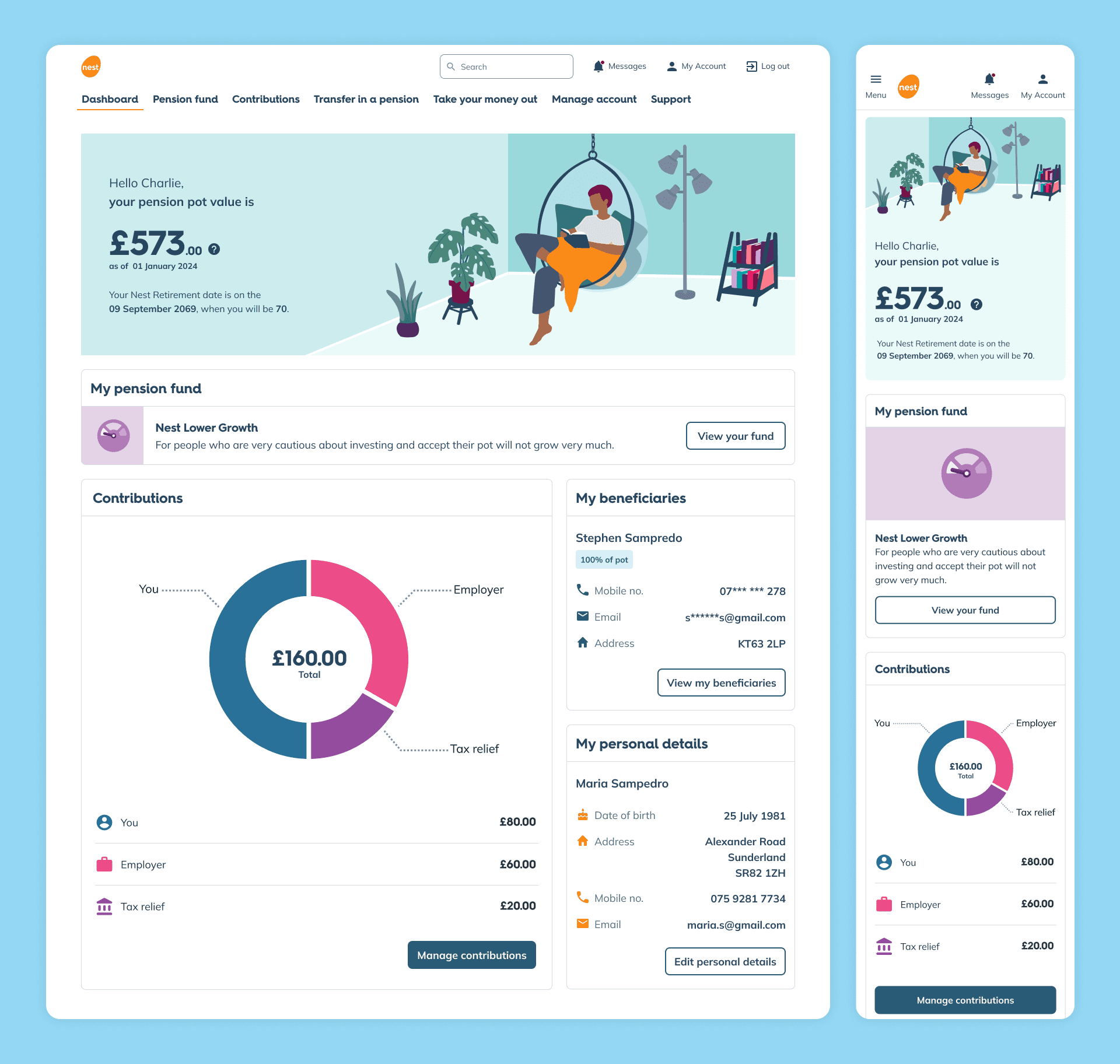
Before: The member's dashboard was sparse, with a confusing layout, and inconsistent design language with the rest of the logged in experience. The most important information was difficult to understand or completely missing.
After: We completely transformed the dashboard visually. The most important information, their pension pot value, is placed in the hero with the rest of the dashboard providing key overview of their pension account. A modular approach accommodates future updates based on operational changes, campaigns, or a member's life stage.
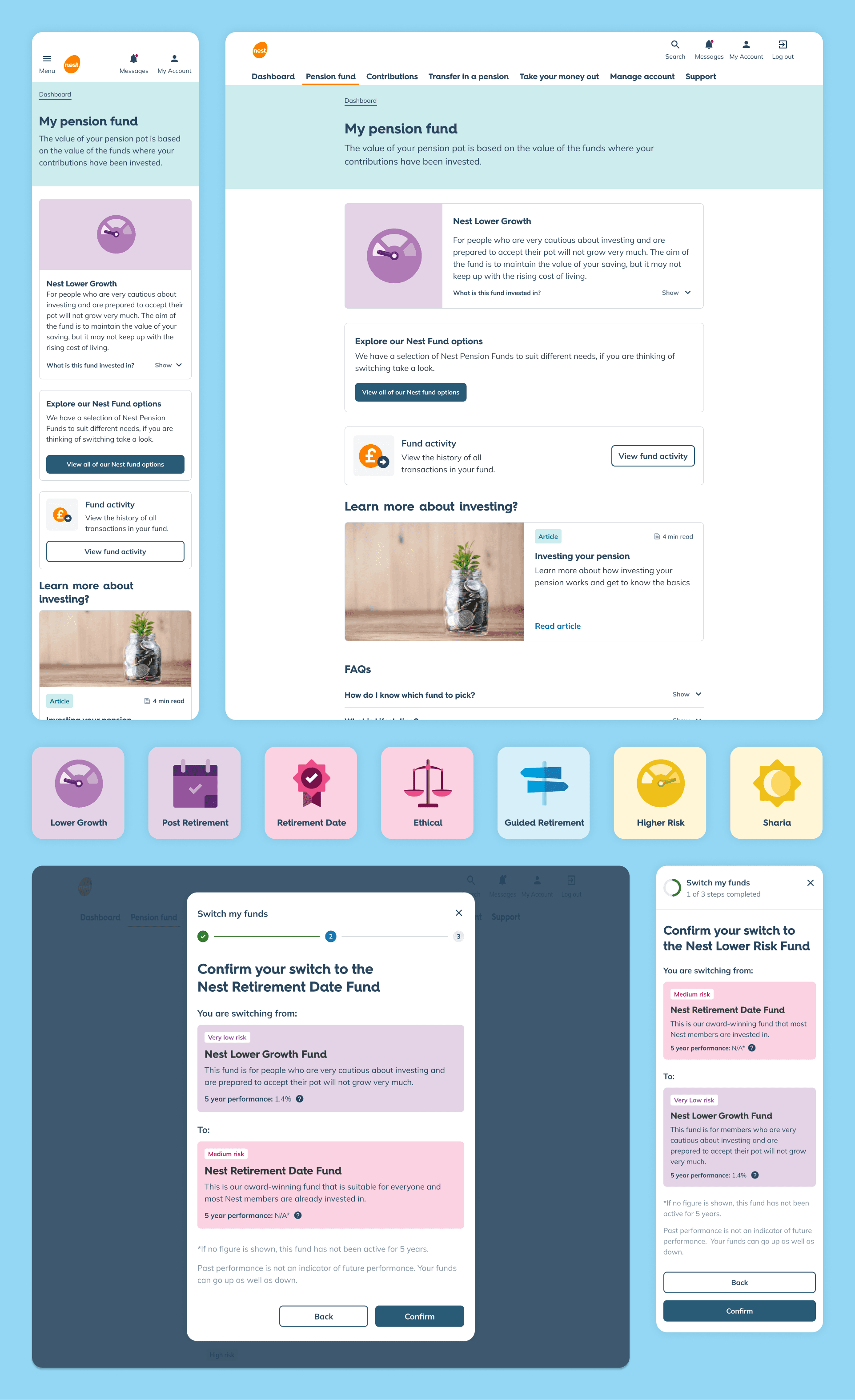
Pension funds
Before: The vast majority of Nest members never switch their fund. They aren't aware of what a pension fund actually means or what options are available.
After: The redesigned pension funds landing page makes it clear which fund their pension is currently invested in, what that actually means, and a gentle introduction to fund switching. Dashboard notifications were also introduced to nudge users into reviewing and/or updating their fund, leading to further engagement.
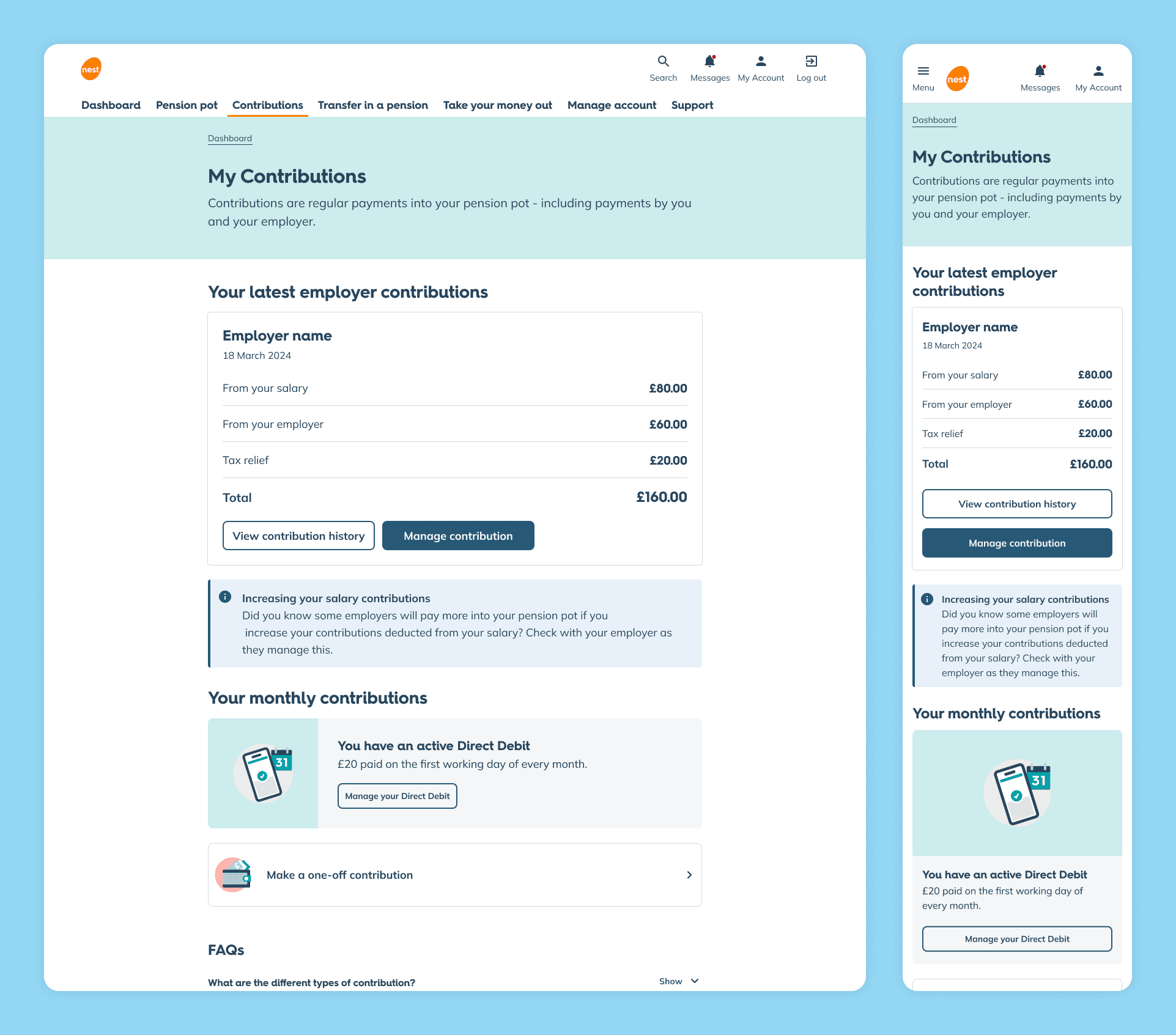
Contributions
Before: users found it tricky to understand what contributions actually meant; especially the difference between employer and personal contributions. On top of that, CTA's were too ambiguous, meaning the small percentage of members that actually wanted to engage with their Nest pension found it difficult to do so.
After: With a redesigned overview, users can now quickly understand how their contributions are made up, see employer and personal payments at a glance, and take action with confidence, such as viewing their contribution history, thanks to clearer and consistent CTAs.
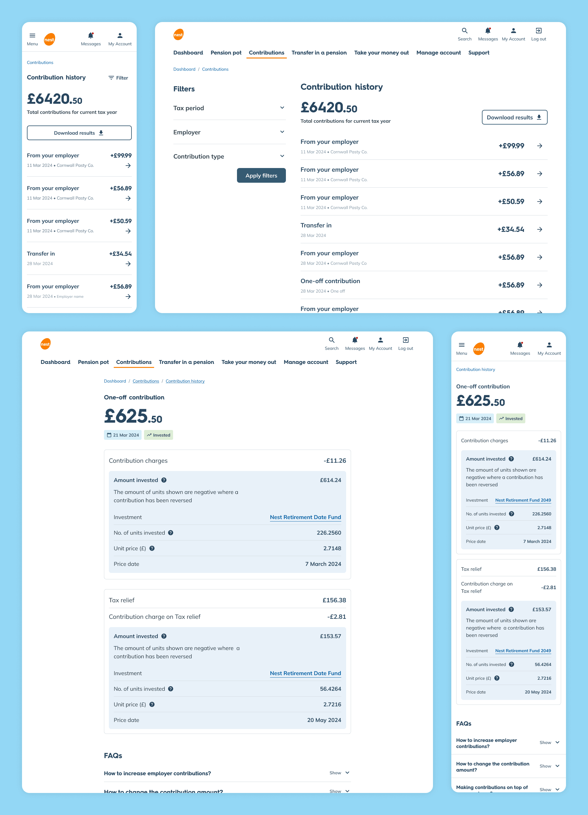
Contribution history
Before: members had to submit a request to download their contribution history. This unnecessary friction often resulted in contacting the call centre for support. On top of that, it was hard to track when a contribution was actually paid, or follow its journey through investment and tax relief stages.
After: members have full access to their contribution history, with the ability to search, filter and download as needed. Members can view a breakdown of each contribution, using plain language and helpful tooltips to explain each stage of the process, from payment through to investment and tax relief.
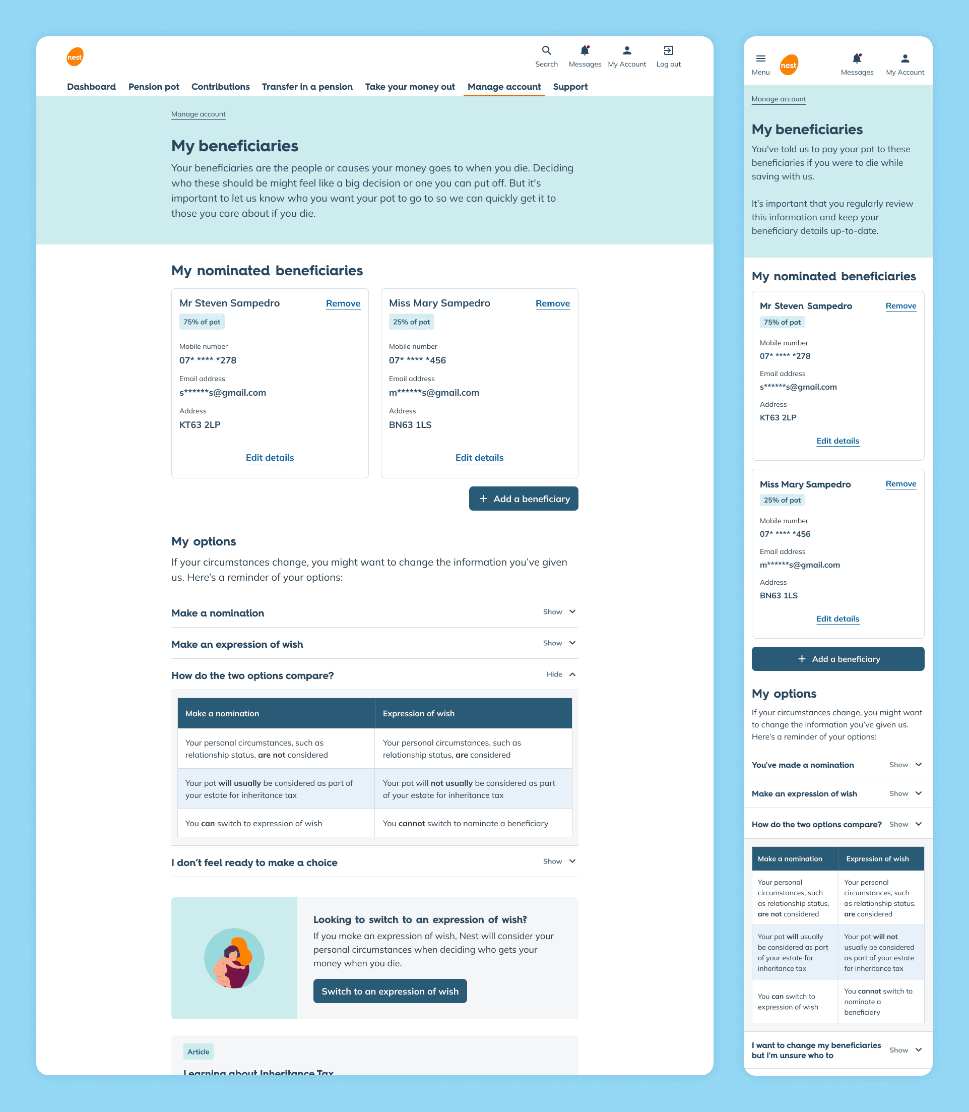
Beneficiaries
Before: While most members would receive emails encouraging them to update their beneficiaries, there was no way to intuitively find that information independently. Manage account was hidden behind a utility nav dropdown, and beneficiaries weren't mentioned anywhere else in the logged-in experience.
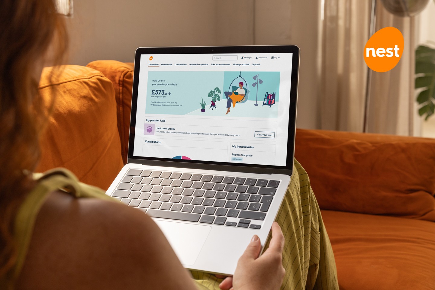
After: A dedicated card now sits on the dashboard, making it much easier for members to add and manage their beneficiaries. The beneficiaries page follows a layout consistent with the wider logged-in experience, and uses progressive disclosure to tackle a complex subject – surfacing the right information at the right time, rather than bombarding members and overwhelming them.
'Before you start' and summary pages
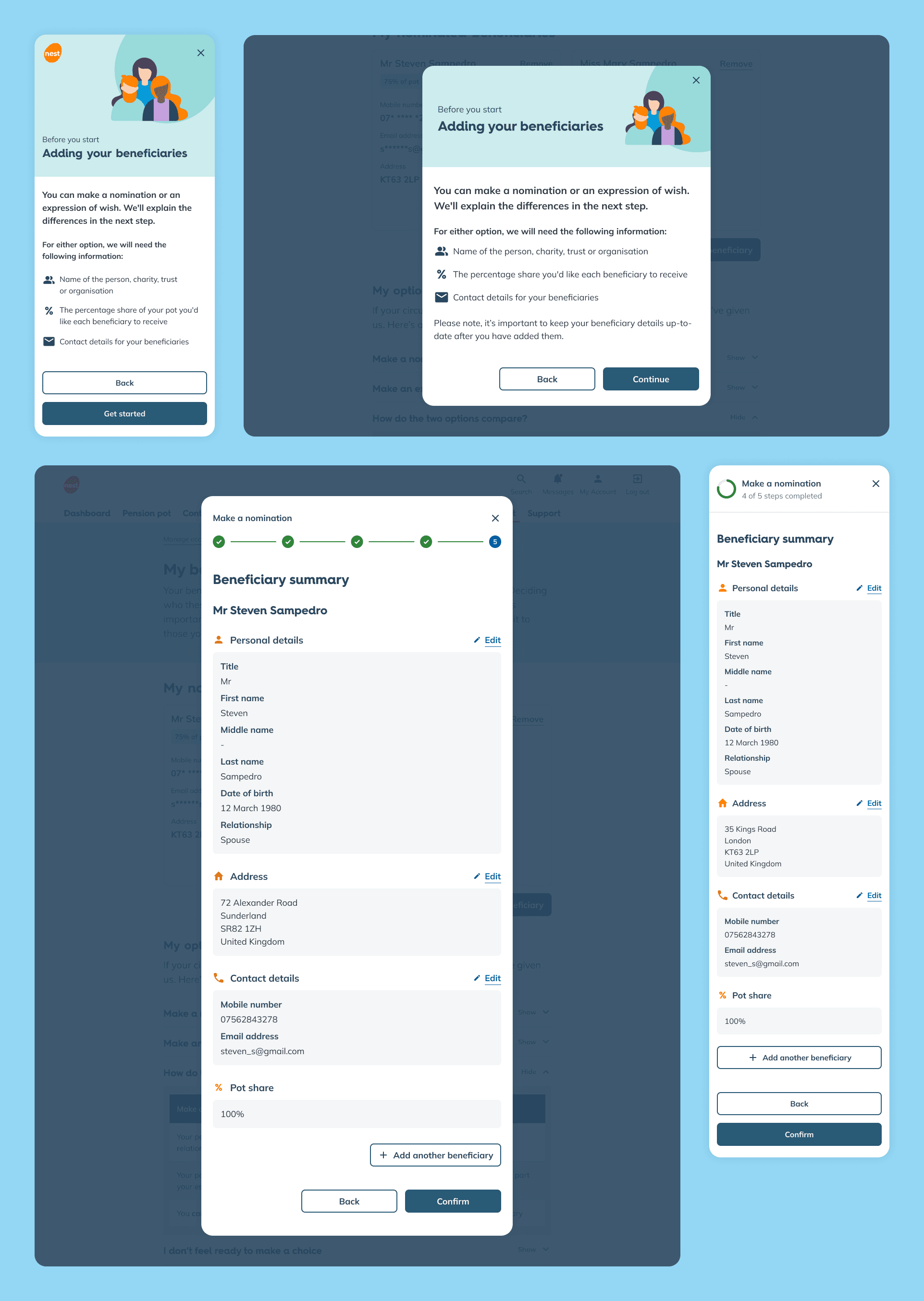
Before: For the small percentage of members who did engage with their online Nest account, drop-outs were common. Members weren't told upfront what information was required, leaving them suddenly stuck midway through. To make matters worse, members were frequently caught off guard by clicking continue and not realising it was the final step and their request was now submitted before they were ready.
After: We introduced a 'before you start' screen that sets clear expectations ahead of each task, giving members a chance to prepare before they begin. And rather than ending abruptly, every task now finishes with a summary screen that gives members a chance to review and edit their information before submitting, removing the risk of accidental or premature requests.
The insights
(aka what we learned and what we'd do differently)
The W3C website is overwhelming and hard to understand. Everyone found this checklist much clearer as an educational tool and tracker.
Despite being the most stressful activity, the SDM proved an invaluable asset, providing guidance and ‘receipts’ when needed most.
Siloing UI and UX becomes detrimental to the project. A consistent designer from start to finish avoids rushed, incomplete handovers and gaps in knowledge.
Public-sector services are a Pandora’s box. Even the simplest of things can hide years of internal friction, legacy tech, and a fear of change.
Escalations may seem dramatic, but it’s a language public-sector services understand, so do it sooner than later to deal with blockers.
Public-sector work often involves longer feedback loops, heavier governance, and endless stakeholders. Focus on the small wins to keep the team motivated.
The impact
(aka what our work achieved and how users reacted to it)
The TL:DR
(aka when you're very busy or don't like long pages)
Goal: Transform the Nest experience to make things easier, more engaging, and more rewarding.
Problem: The public site and logged-in area were disjointed, the UI felt dated, and limited in-context help drove calls and drop-offs. Members lacked basic understanding of Nest/workplace pensions. Employers struggled with setup, eligibility criteria, and data input
What we did: Journey-mapping workshops, heuristic reviews, best-in-class benchmarking, and personas creation. Built and tested 15 vision concepts, then prioritised what to take forward. Created a Service Design Methodology (SDM) to keep multiple teams aligned on roles, decisions, and delivery stages.
Solution: Four teams delivered major improvements to the member and employer experience by transforming existing features, introducing new features, conducting regular testing, adhering to accessibility requirements, and creating a new design system
Impact: After launch, login issues dropped 50%, account activation rose 8%, and registration-related calls fell 14%. In 2025, Nest also recorded its first annual profit and began repaying its 2011 DWP loan.
Key lessons: The W3C guidance felt overwhelming, so the NHS accessibility checklist became our go-to for practical learning and day-to-day checks. The SDM was hard work but crucial for staying aligned and course-correcting. And with public-sector pace and legacy complexity, early escalation helped unblock progress while smaller wins kept momentum.