How do can Nielsen Media best celebrate their new brand?
…aka create a site that showcases the new brand personality with the option to download key brand assets.
The background
(aka introducing the client and the project)
As the website redesign and design system project was drawing to a close, Nielsen approached us about a further collaboration. Inspired by the motion exploration we did for the design system, Nielsen wanted a dedicated microsite that could celebrate the new brand while and hosting downloadable assets.
The problem
(aka what we heard)
Initially, there was misalignment within the Nielsen team about the purpose of the brand site. Some wanted a standard/functional brand site which told the story of the new brand with downloadable assets. Others wanted the site to be a show-stopper that presents Nielsen as an innovative and experimental company with lots of personality and confidence.
We ran a series of workshops to review existing microsites that ranged from more traditional experiences that focused on usability to highly interactive experiences that focused on storytelling.
From these conversations, the client was able to find consensus that essentially combined both approaches. They wanted something fun and interactive showcasing the new brand’s personality, but also something practical they can share with their network to download key brand assets.
From there, we were able to define some requirements with the client. The site was to be split into 10 pages; one dedicated to each brand element such as colour and typography. Each page had to be completely unique. The most important (yet challenging) requirement was ensuring the mobile experience was as identical to desktop as possible, which meant considering interaction methods and layouts in both landscape and portrait.
The approach
(aka what we did to find the right solutions)
With such an abstract brief, a client still unsure of what they actually wanted, and limitations around responsiveness and re-using elements, the majority of this project was spent on exploration and feasibility.
We ran several ideation workshops with the client, which helped to refine the content, principles, and objectives.
Design principles
Accessible and inclusive
Interactive
Unexpected
Clear storytelling/intuitive UI
Motion
Authentic personality
Business objectives
Showcases the new brand
Resource for brand assets and how they should be used
Attracts new talent
Positions Nielsen as innovative and experimental
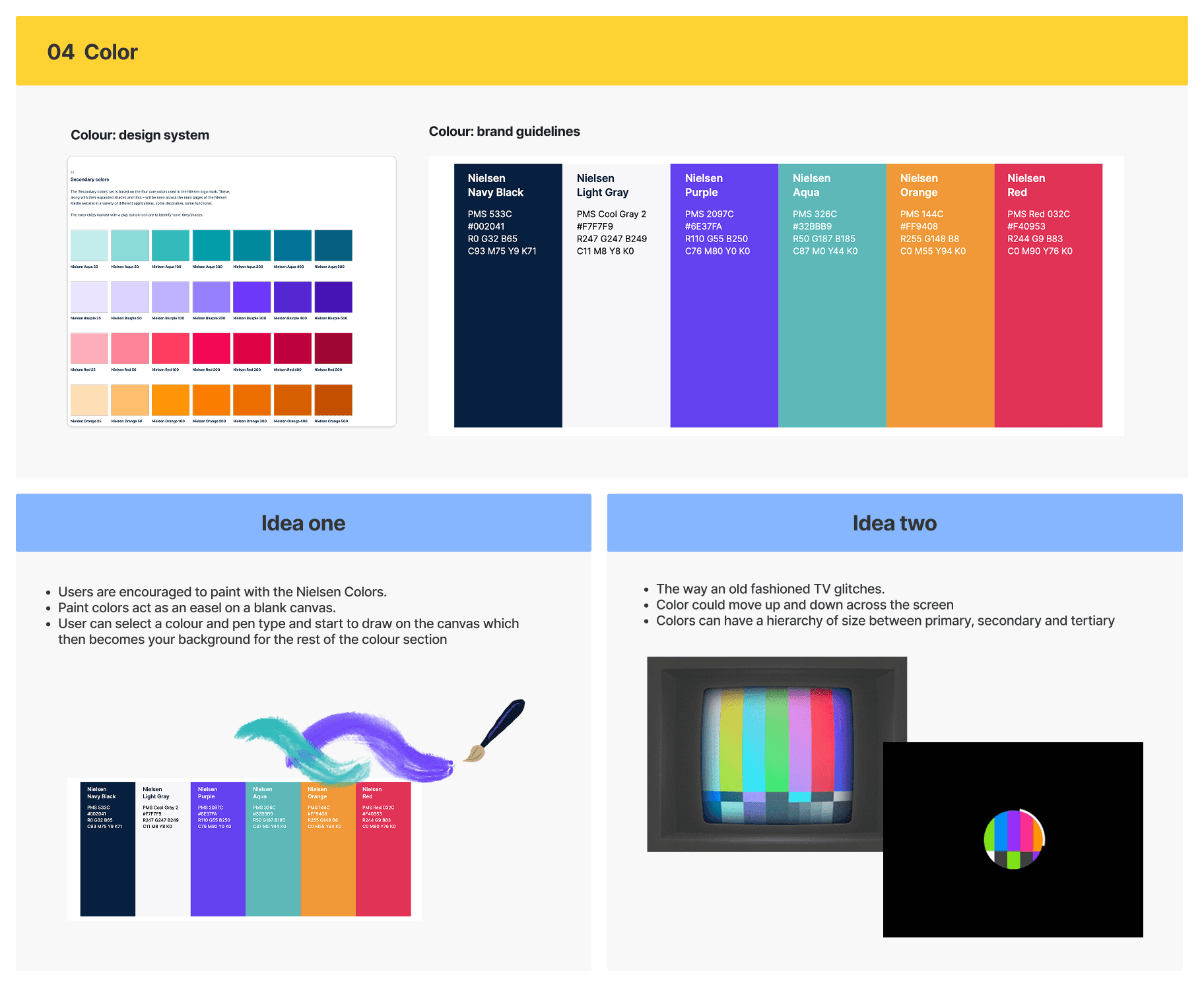
Example of content from ideation workshop
Example of exploration based on literal media representation
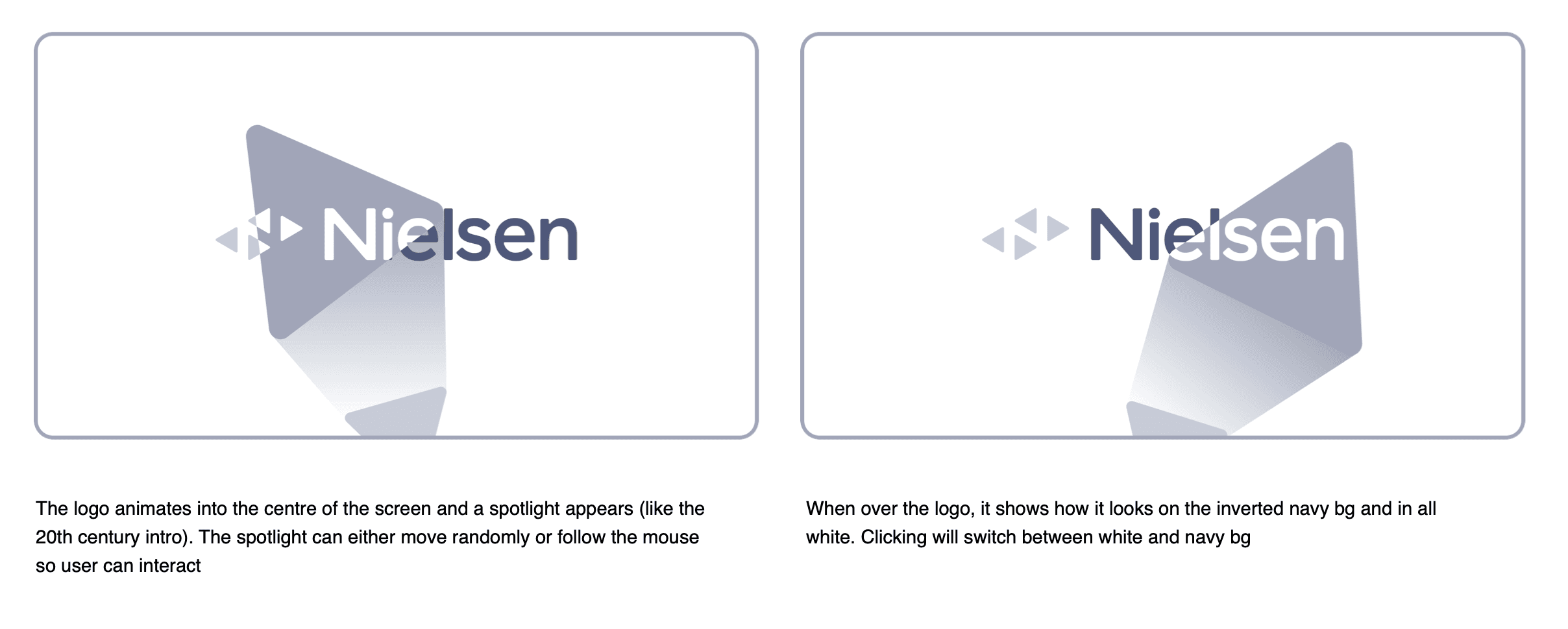
To create experiences that were identical across screen sizes, we had to think of the interactions from a mobile-first perspective. This instantly excluded interactions like hover and keyboard inputs.
Because the site also had a practical requirement, we had to make it very user friendly. This informed choices around global UI, the addition of contextual pop ups, and clear instructions. This also led to the choice that limit each section would be limited to a single interaction type (i.e. a click or a drag) so cognitive load was minimal.
Due to the abstract nature of the work and Figma’s prototyping limitations, we relied on a motion designer to create quick mock ups for the client. We found it easier to get feedback when they could see the concepts come to life vs static images or storyboards. Example below of animated loader exploration.
The designs
(aka what we created to make Nielsen.com a delightful, accessible, and lead generating experience)
Homepage
With an animated intro and loader, we wanted it to be clear from the very first moment that this site was something special. As users scroll through the homepage, they are introduced to the purpose of the site, with the brand personality front and centre. Useful links are presented before opening the navigation menu.
Tone of voice
The next chapter of Nielsen is summed up in four words: Human, Helpful, Courageous, and Vibrant. Behind each word, users are guided through examples of how they can integrate Nielsen’s new tone of voice into their content.
Logo
Logo rules don’t shouldn’t be restricted to flat, forgettable PDFs. Instead, users can switch colour variations as the logo collides with surrounding 'playsteroids', turning margin and clear-space guidance into something far more dynamic and memorable.
Colour
Interacting with Nielsen's colour palette should feel as fun as the brand itself. So, we let users explore Nielsen’s palette through interactive tiles, dive into every tint and shade, copy hex codes instantly, and apply colours to the background in real time.
Typography
To celebrate Nielsen's new font, we designed the typography page as an interactive moment of discovery. As users scroll, Nielsen’s new typeface shifts through its different weights in a way that feels playful, surprising, and full of personality.
Motion spectrum
As a standout of Nielsen’s new brand, the motion spectrum needed to feel every bit as playful as it was flexible. This page lets users explore colour combinations, change the direction of the spectrum, and download either their own custom creation or a set of pre-made examples.
Data viz
A continuous animation brings different data visualisation styles to life, creating a visually engaging way to show how Nielsen presents data clearly and confidently.
Iconography
With four colour options for every icon, the library could easily have felt overwhelming. Instead, this tile-based approach makes it fast and intuitive to explore by group, explore all colour variations, and download the full set when needed.
Image library
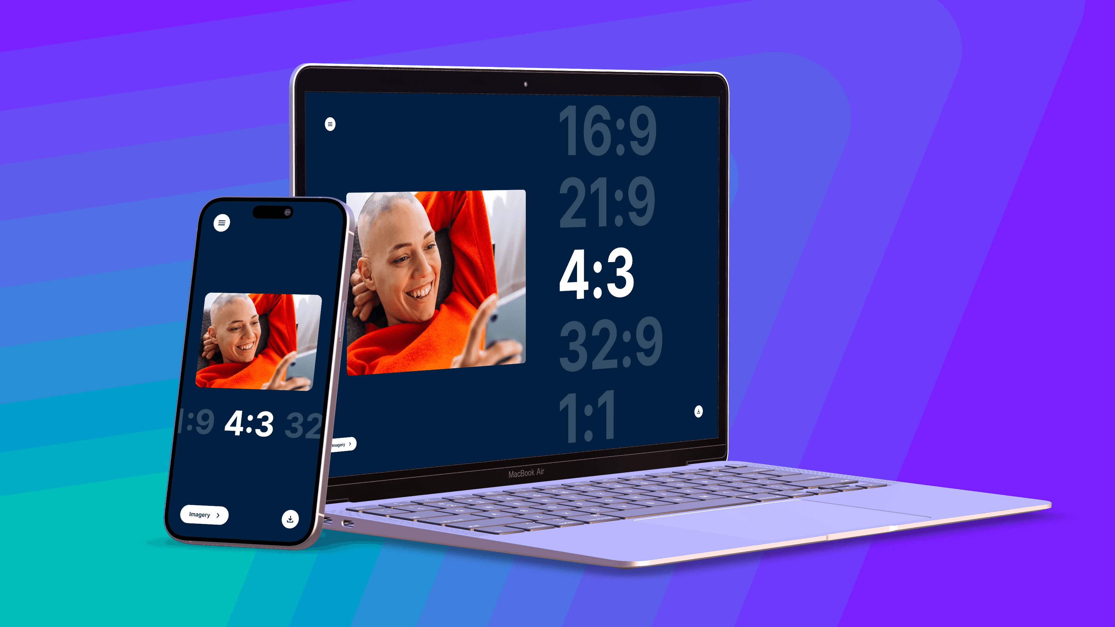
Nielsen’s image library was designed as an endless grid that users can explore in any direction, creating a more immersive and unexpected way to browse imagery. Tags support quick filtering, while clicking an image shows the approved aspect ratios.
Downloading assets
To make the site as practical as it was expressive, every page included a dedicated download flow. Users could quickly grab everything from the page they were on, jump straight to the wider brand library, or toggle specific assets on and off to create a download that matched exactly what they needed.
The insights
(aka what we learned and what we'd do differently)
Even if something doesn't go live, it’s still great to have an opportunity to work on something so abstract and fun
When creating a highly interactive experience, removing hover as an option actually leads you to more interesting interactions than you’d have originally explored
When building something so interactive and abstract, having a motion designer mock up examples really helps when presenting to clients
The impact
(aka what our work achieved and how users reacted to it)
Unfortunately, due to build delays on the main website and its impact on the budget, the brand site was parked post-handover and never went live :(
But both the W12 and the Nielsen team said it was the most memorable project they’ve worked on because it was so abstract and creative :)
The TL:DR
(aka when you're very busy or don't like long pages)
Goal: Create a brand site that celebrated Nielsen’s new identity while giving people an easy way to explore and download key brand assets.
Problem: There was early misalignment around what the brand site should be. Some stakeholders wanted something clear and functional, while others wanted something expressive and memorable. It also needed to work consistently across desktop and mobile.
What we did: We spent much of the project exploring ideas, testing interactions, and pushing the brand in different directions. Working mobile-first helped us design interactions that translated well across screen sizes, while motion mock-ups made it much easier to bring abstract ideas to life and get feedback quickly.
Solution: We designed an interactive 10-page brand site concept that balanced personality with practicality. Each page explored a different part of the brand in a unique way, while still making the overall experience clear, usable, and easy to navigate.
Impact: The site was parked after handover due to delays and budget pressure on the main website build, so it never launched. Even so, it was seen by both Nielsen and the internal team as one of the most memorable and creatively rewarding projects to work on.
Key lessons: Not every successful project has to go live. This one was a reminder that creative exploration still has real value, and that removing expected interactions like hover can often lead to more interesting ideas.