How can Virgin Atlantic become the world's most-loved travel company?
…aka design and deliver a world-class omni-channel experience for Virgin Atlantic Holidays
The background
(aka introducing the client and the project)
Virgin Atlantic is an airline specialising in long-haul, transatlantic flights. Virgin Holidays is a tour operator specialising in package holidays to the USA and the Caribbean. Both are co-owned by the Virgin Group and Delta Air Lines.
In a post-Covid world, the decision was made to combine both brands under the Virgin Atlantic brand and transition their digital experience away from Delta-owned platforms. To support the merger, Virgin Atlantic partnered with W12 (now TCS Interactive) to design a unified, seamless, end-to-end experience.
The problem
(aka what we heard)
Across the existing websites and apps, the customer experience is fractured – even within the individual brands. Combining it all into a truly seamless experience would require rebuilding the VA experience from the ground up.
Virgin Atlantic had access to a wealth of customer data but wasn't using it effectively. The result showed up in the experience: limited self-service options meant customers frequently had to call for help, leading to long wait times and unnecessary friction.
Both brands had existing apps, and with a new Design System already in progress internally, a lift and shift was initially considered as a starting point, but the limited functionality and reliance on Delta-owned platforms made that approach impractical. The apps were poorly built, utilitarian in nature, and extremely frustrating to use. Neither possessed the confident voice and expertise that customers were increasingly seeking as the world reopened after Covid.
Early conversations alluded to aspirational goals, with “to be the world's most-loved travel company” becoming a North Star vision. However, as we began to dig deeper, aspiration was replaced with urgency.
The client had no strategic roadmap or internal alignment on merging the two brands. We were stuck between internal teams from each brand with conflicting goals. The only thing set in stone was a date: SOMETHING needed to be released within 6 months.
That meant we had to design something that could be built within a few months, that met the conflicting needs of multiple teams, and still felt like the first chapter in Virgin Atlantic’s goal of becoming “the world’s most-loved travel company”.
We also discovered that an internal design team would be redesigning the web experience in parallel. With their own tight deadlines and no formal plan to align, the two workstreams would essentially be running independently (beyond sharing the same design system).
No pressure then 😅
The approach
(aka what we did to find the right solutions)
We began with a series of immersion workshops and interviews to understand the current experience, the client's goals (which is where we discovered the pressing timeline), and the competitor landscape. We also ran two ideation sessions using a "How might we…" format to frame the discussion and quick-fire sketching sessions to visualise those ideas.
Example of concept sketches for workshop synthesis
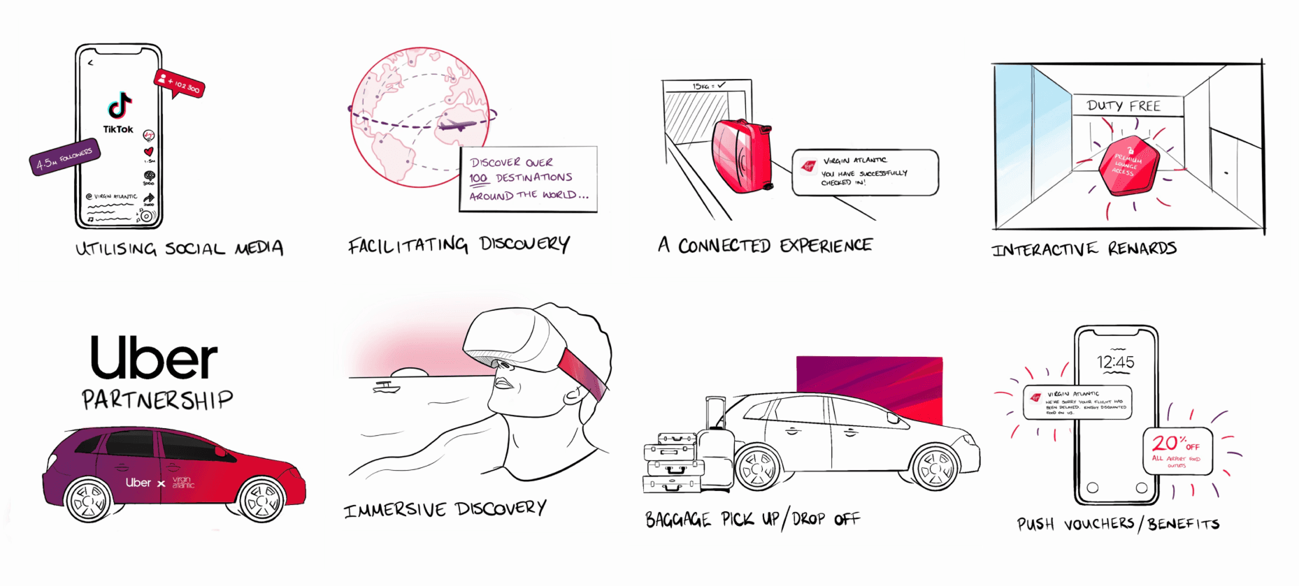
From these workshops and reviews, we distilled everything into four business objectives and four guiding principles; creating a foundation designed to keep real human needs at the heart of every decision.
The business objectives
From deeper customer understanding to lasting emotional connection, the objectives will deliver better outcomes from the business and their customers.
Know the customer
" transform="translate(14 13)" width="8px"/><path d="M 2.5 0 L 0.939 1.56 L 0 0.625" fill="transparent" height="1.5604000000000013px" id="hMzVyX96A" stroke-dasharray="" stroke-linecap="round" stroke-linejoin="round" stroke-width="1.5" stroke="rgb(218, 5, 48)" transform="translate(16.75 16.267)" width="2.5px"/><path d="M 0 2.5 C 0 1.119 1.119 0 2.5 0 L 4 0" fill="transparent" height="2.5px" id="kyfFY5W0R" stroke-dasharray="" stroke-linecap="round" stroke-linejoin="round" stroke-width="1.4824" stroke="rgb(218, 5, 48)" transform="translate(7 14.5)" width="4px"/><path d="M 0 2.5 C 0 1.119 1.119 0 2.5 0 C 3.881 0 5 1.119 5 2.5 C 5 3.881 3.881 5 2.5 5 C 1.119 5 0 3.881 0 2.5 Z" fill="transparent" height="5px" id="tsIz8TLyX" stroke-dasharray="" stroke-linecap="round" stroke-linejoin="round" stroke-width="1.5" stroke="rgb(218, 5, 48)" transform="translate(9.5 7)" width="5px"/><path d="M 9 18 L 5 18 C 2.239 18 0 15.761 0 13 L 0 5 C 0 2.239 2.239 0 5 0 L 13 0 C 15.761 0 18 2.239 18 5 L 18 8" fill="transparent" height="18px" id="m8Ezo1Cnf" stroke-dasharray="" stroke-linecap="round" stroke-linejoin="round" stroke-width="1.5" stroke="rgb(218, 5, 48)" transform="translate(3 3)" width="18px"/></svg>)
Reduce call volume
" transform="translate(17 10)" width="4px"/><path d="M 3 7 L 2 7 C 0.895 7 0 6.105 0 5 L 0 2 C 0 0.895 0.895 0 2 0 L 3 0 C 3.552 0 4 0.448 4 1 L 4 6 C 4 6.552 3.552 7 3 7 Z" fill="transparent" height="7px" id="WLPb2rwIZ" stroke-dasharray="" stroke-linecap="round" stroke-linejoin="round" stroke-width="1.5" stroke="rgb(218, 5, 48)" transform="translate(3 10)" width="4px"/><path d="M 13 7 L 13 6.5 C 13 2.91 10.09 0 6.5 0 L 6.5 0 C 2.91 0 0 2.91 0 6.5 L 0 7" fill="transparent" height="7px" id="AdG_AW4rJ" stroke-dasharray="" stroke-linecap="round" stroke-linejoin="round" stroke-width="1.5" stroke="rgb(218, 5, 48)" transform="translate(5.5 3)" width="13px"/><path d="M 2.5 2.5 L 1.25 2.5 C 0.56 2.5 0 1.94 0 1.25 L 0 1.25 C 0 0.56 0.56 0 1.25 0 L 2.5 0 C 3.19 0 3.75 0.56 3.75 1.25 L 3.75 1.25 C 3.75 1.94 3.19 2.5 2.5 2.5 Z" fill="transparent" height="2.5px" id="EjERlQy7S" stroke-dasharray="" stroke-linecap="round" stroke-linejoin="round" stroke-width="1.5" stroke="rgb(218, 5, 48)" transform="translate(10.125 18.75)" width="3.75px"/><path d="M 0 3 L 2.125 3 C 3.23 3 4.125 2.105 4.125 1 L 4.125 0" fill="transparent" height="3px" id="V20fuy5FT" stroke-dasharray="" stroke-linecap="round" stroke-linejoin="round" stroke-width="1.5" stroke="rgb(218, 5, 48)" transform="translate(13.875 17)" width="4.125px"/></svg>)
Increase revenue
" transform="translate(4 3)" width="16px"/><path d="M 2 2 L 2 0 L 0 0" fill="transparent" height="2px" id="kOWYZFZkF" stroke-dasharray="" stroke-linecap="round" stroke-linejoin="round" stroke-width="1.5" stroke="rgb(218, 5, 48)" transform="translate(14 7)" width="2px"/><path d="M 2.5 2 L 0 0" fill="transparent" height="2px" id="iUShD4ZQt" stroke-dasharray="" stroke-linecap="round" stroke-linejoin="round" stroke-width="1.5" stroke="rgb(218, 5, 48)" transform="translate(10.5 8)" width="2.5px"/><path d="M 1.5 0 L 0 1.5" fill="transparent" height="1.5px" id="kbgWn8lGg" stroke-dasharray="" stroke-linecap="round" stroke-linejoin="round" stroke-width="1.5" stroke="rgb(218, 5, 48)" transform="translate(9 8)" width="1.5px"/><path d="M 0 3 L 2.998 0" fill="transparent" height="3px" id="r2nXcgBiB" stroke-dasharray="" stroke-linecap="round" stroke-linejoin="round" stroke-width="1.5" stroke="rgb(218, 5, 48)" transform="translate(13.002 7)" width="2.9984px"/><path d="M 0 0 L 4 0" fill="transparent" height="1px" id="uRXODQ4Zf" stroke-dasharray="" stroke-linecap="round" stroke-linejoin="round" stroke-width="1.5" stroke="rgb(218, 5, 48)" transform="translate(12 13)" width="4px"/><path d="M 0 0 L 4 0" fill="transparent" height="1px" id="dkw1wtb5v" stroke-dasharray="" stroke-linecap="round" stroke-linejoin="round" stroke-width="1.5" stroke="rgb(218, 5, 48)" transform="translate(12 16)" width="4px"/><path d="M 0 0 L 0 0.808" fill="transparent" height="1px" id="MoRQf8YZb" stroke-dasharray="" stroke-linecap="round" stroke-linejoin="round" stroke-width="1.5" stroke="rgb(218, 5, 48)" transform="translate(6.5 12)" width="1px"/><path d="M 0 1.624 C 0.117 0.632 1.005 -0.086 2 0.008" fill="transparent" height="1.6241395700310601px" id="h_DPpqpfn" stroke-dasharray="" stroke-linecap="round" stroke-linejoin="round" stroke-width="1.5" stroke="rgb(218, 5, 48)" transform="translate(4.5 12.799)" width="2px"/><path d="M 0 0.808 L 0 0" fill="transparent" height="1px" id="ObdMfrcLl" stroke-dasharray="" stroke-linecap="round" stroke-linejoin="round" stroke-width="1.5" stroke="rgb(218, 5, 48)" transform="translate(6.5 19.192)" width="1px"/><path d="M 2 0 C 1.883 0.993 0.995 1.71 0 1.616" fill="transparent" height="1.6240405830737146px" id="JJ4Xytelc" stroke-dasharray="" stroke-linecap="round" stroke-linejoin="round" stroke-width="1.5" stroke="rgb(218, 5, 48)" transform="translate(6.5 17.576)" width="2px"/><path d="M 1.949 1.267 C 1.648 0.463 0.857 -0.05 0 0.004" fill="transparent" height="1.2670475902989544px" id="tnC1fMwmB" stroke-dasharray="" stroke-linecap="round" stroke-linejoin="round" stroke-width="1.5" stroke="rgb(218, 5, 48)" transform="translate(6.5 12.804)" width="1.9490700000000007px"/><path d="M 0 0 C 0.301 0.804 1.092 1.317 1.949 1.263" fill="transparent" height="1.267047590298958px" id="BhjssnU3C" stroke-dasharray="" stroke-linecap="round" stroke-linejoin="round" stroke-width="1.5" stroke="rgb(218, 5, 48)" transform="translate(4.551 17.929)" width="1.9490699999999999px"/><path d="M 0 0 L 0 0 C 0 0.684 0.483 1.273 1.154 1.407 L 2.846 1.746 C 3.517 1.88 4 2.469 4 3.153 L 4 3.153" fill="transparent" height="3.152799999999999px" id="hDWHA1ISF" stroke-dasharray="" stroke-linecap="round" stroke-linejoin="round" stroke-width="1.5" stroke="rgb(218, 5, 48)" transform="translate(4.5 14.424)" width="4px"/></svg>)
Grow loyalty
" transform="translate(2.996 2.995)" width="18.00586257093672px"/><path d="M 4.528 0 C 5.66 0 6.42 1.024 6.42 1.979 C 6.42 3.974 3.845 5.502 3.209 5.502 C 2.574 5.502 0 3.974 0 1.979 C 0 1.024 0.759 0 1.892 0 C 2.539 0 2.963 0.311 3.21 0.589 C 3.456 0.311 3.881 0 4.528 0 Z" fill="transparent" height="5.50234px" id="vLurisOb7" stroke-dasharray="" stroke-linecap="round" stroke-linejoin="round" stroke-width="1.5" stroke="rgb(218, 5, 48)" transform="translate(8.791 9.499)" width="6.41963px"/></svg>)
The guiding principles
From reducing complexity to creating more impact, the principles will shape how the experience should look, feel, and speak.
Move from utility to destination
" transform="translate(6 2)" width="2px"/><path d="M 9.389 1.611 C 11.537 3.759 11.537 7.241 9.389 9.389 C 7.241 11.537 3.759 11.537 1.611 9.389 C -0.537 7.241 -0.537 3.759 1.611 1.611 C 3.759 -0.537 7.241 -0.537 9.389 1.611" fill="transparent" height="11.000049999999995px" id="Ex80KTs_4" stroke-dasharray="" stroke-linecap="round" stroke-linejoin="round" stroke-width="1.5" stroke="rgb(218, 5, 48)" transform="translate(1.5 11)" width="11.00000575px"/><path d="M 4.95 4.95 L 2.475 0 L 0 4.95" fill="transparent" height="4.949999999999999px" id="wq4n4rloj" stroke-dasharray="" stroke-linecap="round" stroke-linejoin="round" stroke-width="1.5" stroke="rgb(218, 5, 48)" transform="translate(4.525 13.602)" width="4.949999999999999px"/><path d="M 0 0 L 3.96 0" fill="transparent" height="1px" id="AvrTzlJsi" stroke-dasharray="" stroke-linecap="round" stroke-linejoin="round" stroke-width="1.5" stroke="rgb(218, 5, 48)" transform="translate(5.02 17.56)" width="3.960000000000001px"/><path d="M 9.389 1.611 C 11.537 3.759 11.537 7.241 9.389 9.389 C 7.241 11.537 3.759 11.537 1.611 9.389 C -0.537 7.241 -0.537 3.759 1.611 1.611 C 3.759 -0.537 7.241 -0.537 9.389 1.611" fill="transparent" height="11.000025px" id="bvzSEv6ZL" stroke-dasharray="" stroke-linecap="round" stroke-linejoin="round" stroke-width="1.5" stroke="rgb(218, 5, 48)" transform="translate(11.5 2)" width="11.000049999999995px"/><path d="M 0 2.475 L 0 0.5 C 0 0.224 0.224 0 0.5 0 L 2.812 0 C 3.495 0 4.05 0.554 4.05 1.237 L 4.05 1.237 C 4.05 1.92 3.496 2.474 2.812 2.474 L 0 2.474 Z" fill="transparent" height="2.4750000000000005px" id="qWDot2_Ko" stroke-dasharray="" stroke-linecap="round" stroke-linejoin="round" stroke-width="1.5" stroke="rgb(218, 5, 48)" transform="translate(15 5.025)" width="4.050000000000001px"/><path d="M 0 0 L 0 1.975 C 0 2.251 0.224 2.475 0.5 2.475 L 3.05 2.475 C 3.733 2.475 4.287 1.921 4.287 1.238 L 4.287 1.238 C 4.287 0.555 3.733 0.001 3.05 0.001" fill="transparent" height="2.4749999999999996px" id="PMcA4lPuV" stroke-dasharray="" stroke-linecap="round" stroke-linejoin="round" stroke-width="1.5" stroke="rgb(218, 5, 48)" transform="translate(15 7.5)" width="4.286999999999999px"/><path d="M 2 0 L 0 2 L 2 4" fill="transparent" height="4px" id="rMxNc2UhF" stroke-dasharray="" stroke-linecap="round" stroke-linejoin="round" stroke-width="1.5" stroke="rgb(218, 5, 48)" transform="translate(16 18)" width="2px"/><path d="M 5 0 L 5 2 C 5 3.105 4.105 4 3 4 L 0 4" fill="transparent" height="4px" id="ndwddoyDp" stroke-dasharray="" stroke-linecap="round" stroke-linejoin="round" stroke-width="1.5" stroke="rgb(218, 5, 48)" transform="translate(16 16)" width="5px"/><path d="M 0 4 L 0 2 C 0 0.895 0.895 0 2 0 L 5 0" fill="transparent" height="4px" id="phTDkgaR6" stroke-dasharray="" stroke-linecap="round" stroke-linejoin="round" stroke-width="1.5" stroke="rgb(218, 5, 48)" transform="translate(3 4)" width="5px"/></svg>)
Simplify the customer journey
" transform="translate(14 4)" width="7px"/><path d="M 5 5 L 3 5 C 1.343 5 0 3.657 0 2 L 0 0" fill="transparent" height="5px" id="mBvshBSn2" stroke-dasharray="" stroke-linecap="round" stroke-linejoin="round" stroke-width="1.5" stroke="rgb(218, 5, 48)" transform="translate(3 11)" width="5px"/><path d="M 3 6 L 2.414 5.414 C 2.149 5.149 1.789 5 1.414 5 C 1.039 5 0.68 5.149 0.414 5.414 L 0.414 5.414 C -0.062 5.891 -0.136 6.638 0.237 7.199 L 2.177 10.109 C 2.548 10.666 3.173 11 3.842 11 L 7.638 11 C 8.646 11 9.497 10.249 9.622 9.248 L 9.984 6.351 C 10.118 5.284 9.383 4.302 8.322 4.129 L 6 3.751 L 6 1.5 C 6 0.672 5.328 0 4.5 0 L 4.5 0 C 3.672 0 3 0.672 3 1.5 Z" fill="transparent" height="11px" id="i8xwDl_b4" stroke-dasharray="" stroke-linecap="round" stroke-linejoin="round" stroke-width="1.5" stroke="rgb(218, 5, 48)" transform="translate(11 10)" width="10.00000076876275px"/><path d="M 0 0 C 0 1.639 1.788 3.389 2.808 4.254 C 3.211 4.582 3.788 4.582 4.191 4.254 C 5.212 3.389 7 1.639 7 0" fill="transparent" height="4.5000125px" id="QAqD7_1cr" stroke-dasharray="" stroke-linecap="round" stroke-linejoin="round" stroke-width="1.5" stroke="rgb(218, 5, 48)" transform="translate(4 5.5)" width="7px"/><path d="M 0.05 0 C 0.078 0 0.1 0.023 0.1 0.05 C 0.1 0.078 0.078 0.1 0.05 0.1 C 0.022 0.1 0 0.078 0 0.05 C 0 0.037 0.005 0.024 0.015 0.015 C 0.024 0.005 0.037 0 0.05 0" fill="transparent" height="1px" id="yAQbCPtax" stroke-dasharray="" stroke-linecap="round" stroke-linejoin="round" stroke-width="1.5" stroke="rgb(218, 5, 48)" transform="translate(7.45 5.45)" width="1px"/><path d="M 0 3.5 L 0 3.5 C 0 1.567 1.567 0 3.5 0 L 3.5 0 C 5.433 0 7 1.567 7 3.5 L 7 3.5" fill="transparent" height="3.5px" id="sM7NYZGXY" stroke-dasharray="" stroke-linecap="round" stroke-linejoin="round" stroke-width="1.5" stroke="rgb(218, 5, 48)" transform="translate(4 2)" width="7px"/></svg>)
Create delightful and memorable moments
" transform="translate(12 3)" width="1px"/><path d="M 0 0 L 2 0" fill="transparent" height="1px" id="RMlLe1kxH" stroke-dasharray="" stroke-linecap="round" stroke-linejoin="round" stroke-width="1.5" stroke="rgb(218, 5, 48)" transform="translate(2 13)" width="2px"/><path d="M 0 0 L 1.1 1.1" fill="transparent" height="1.1000000000000005px" id="vv4C6Q6am" stroke-dasharray="" stroke-linecap="round" stroke-linejoin="round" stroke-width="1.5" stroke="rgb(218, 5, 48)" transform="translate(4.9 5.9)" width="1.1000000000000005px"/><path d="M 1.1 0 L 0 1.1" fill="transparent" height="1.1000000000000005px" id="s2OX7UstL" stroke-dasharray="" stroke-linecap="round" stroke-linejoin="round" stroke-width="1.5" stroke="rgb(218, 5, 48)" transform="translate(18 5.9)" width="1.1000000000000014px"/><path d="M 2 0 L 0 0" fill="transparent" height="1px" id="rN5XgGC6B" stroke-dasharray="" stroke-linecap="round" stroke-linejoin="round" stroke-width="1.5" stroke="rgb(218, 5, 48)" transform="translate(20 12.9)" width="2px"/><path d="M 0 0.375 C 1.1 -0.125 2.5 -0.125 3.6 0.375 C 4.7 0.875 6.1 0.875 7.2 0.375 C 8.3 -0.125 9.7 -0.125 10.8 0.375 C 11.9 0.875 13.3 0.875 14.4 0.375 C 15.5 -0.125 16.9 -0.125 18 0.375" fill="transparent" height="1px" id="Ds6CGYErk" stroke-dasharray="" stroke-linecap="round" stroke-linejoin="round" stroke-width="1.5" stroke="rgb(218, 5, 48)" transform="translate(3 17.025)" width="18px"/><path d="M 0 0.375 C 1.1 0.875 2.5 0.875 3.6 0.375 C 4.7 -0.125 6.1 -0.125 7.2 0.375 C 8.3 0.875 9.7 0.875 10.8 0.375" fill="transparent" height="1px" id="TDFOk0cL_" stroke-dasharray="" stroke-linecap="round" stroke-linejoin="round" stroke-width="1.5" stroke="rgb(218, 5, 48)" transform="translate(6.6 20.225)" width="10.799989999999998px"/><path d="M 0 5 C 0 2.2 2.2 0 5 0 C 7.8 0 10 2.2 10 5" fill="transparent" height="5px" id="HikB0vif4" stroke-dasharray="" stroke-linecap="round" stroke-linejoin="round" stroke-width="1.5" stroke="rgb(218, 5, 48)" transform="translate(7 8)" width="10px"/></svg>)
Speak as a single, unified brand
" transform="translate(7.228 6.102)" width="15.772154687391486px"/><path d="M 16.535 4.788 C 15.09 1.949 12.148 0 8.745 0 C 3.915 0 0 3.917 0 8.75 C 0 13.582 3.915 17.5 8.745 17.5 C 13.575 17.5 17.49 13.583 17.49 8.75 C 17.49 8.489 17.473 8.233 17.451 7.978" fill="transparent" height="17.50004px" id="ZDOL9mytL" stroke-dasharray="" stroke-linecap="round" stroke-linejoin="round" stroke-width="1.498" stroke="rgb(218, 5, 48)" transform="translate(3.5 3.012)" width="17.49px"/><path d="M 2.529 0 C 0.665 1.367 -0.344 2.884 0.106 3.944 C 0.744 5.524 4.344 5.559 8.147 4.022" fill="transparent" height="5.152259033077911px" id="WrUIk0oQt" stroke-dasharray="" stroke-linecap="round" stroke-linejoin="round" stroke-width="1.498" stroke="rgb(218, 5, 48)" transform="translate(0.991 12.349)" width="8.147423214215095px"/></svg>)
But before we could design anything for the vision, we had to figure out how to balance two very different pressures: a 6-month deadline, and the ambition to genuinely transform VA's digital experience.
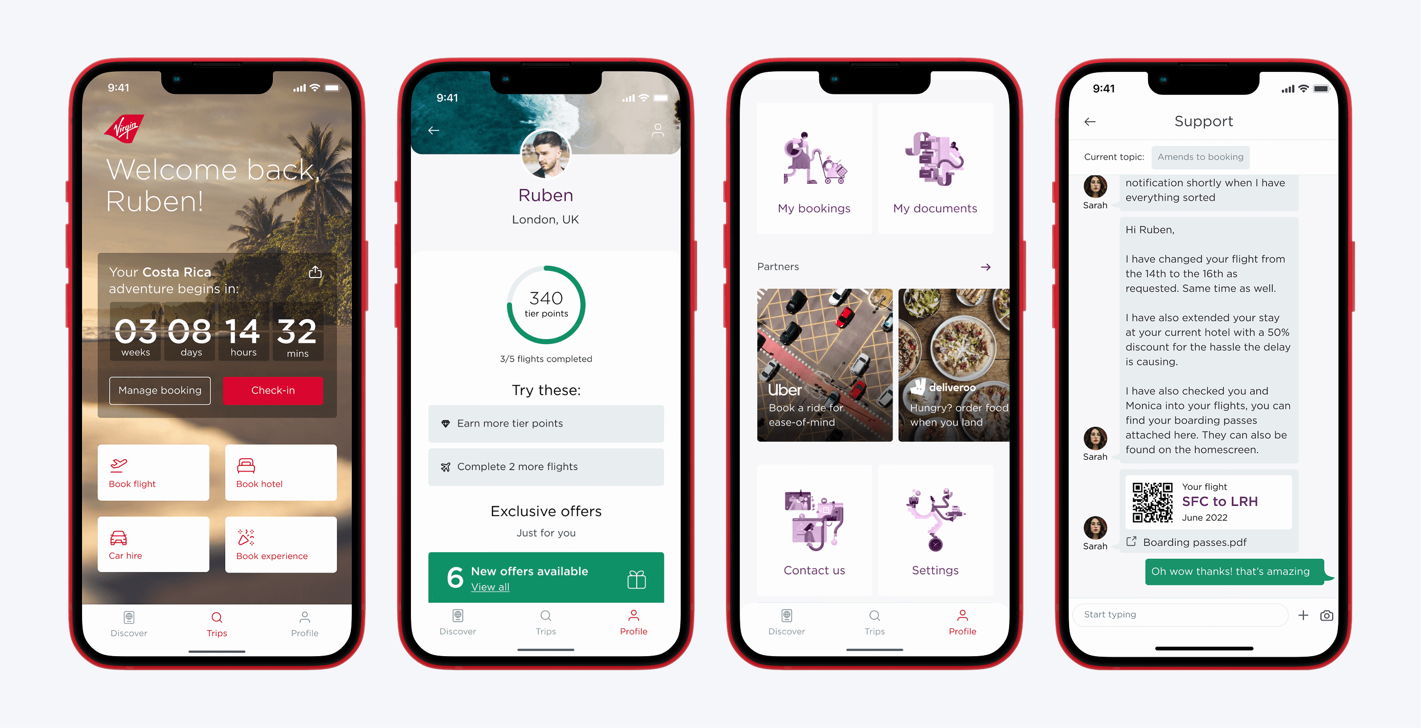
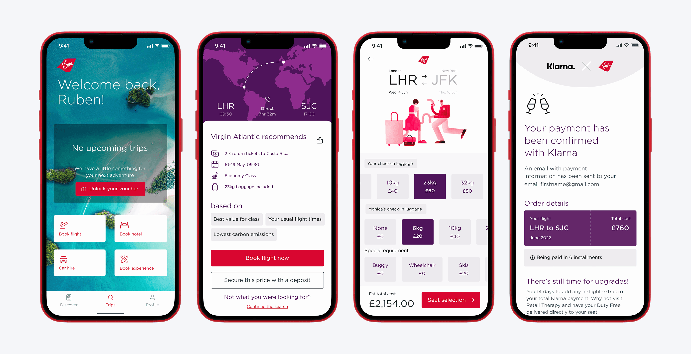
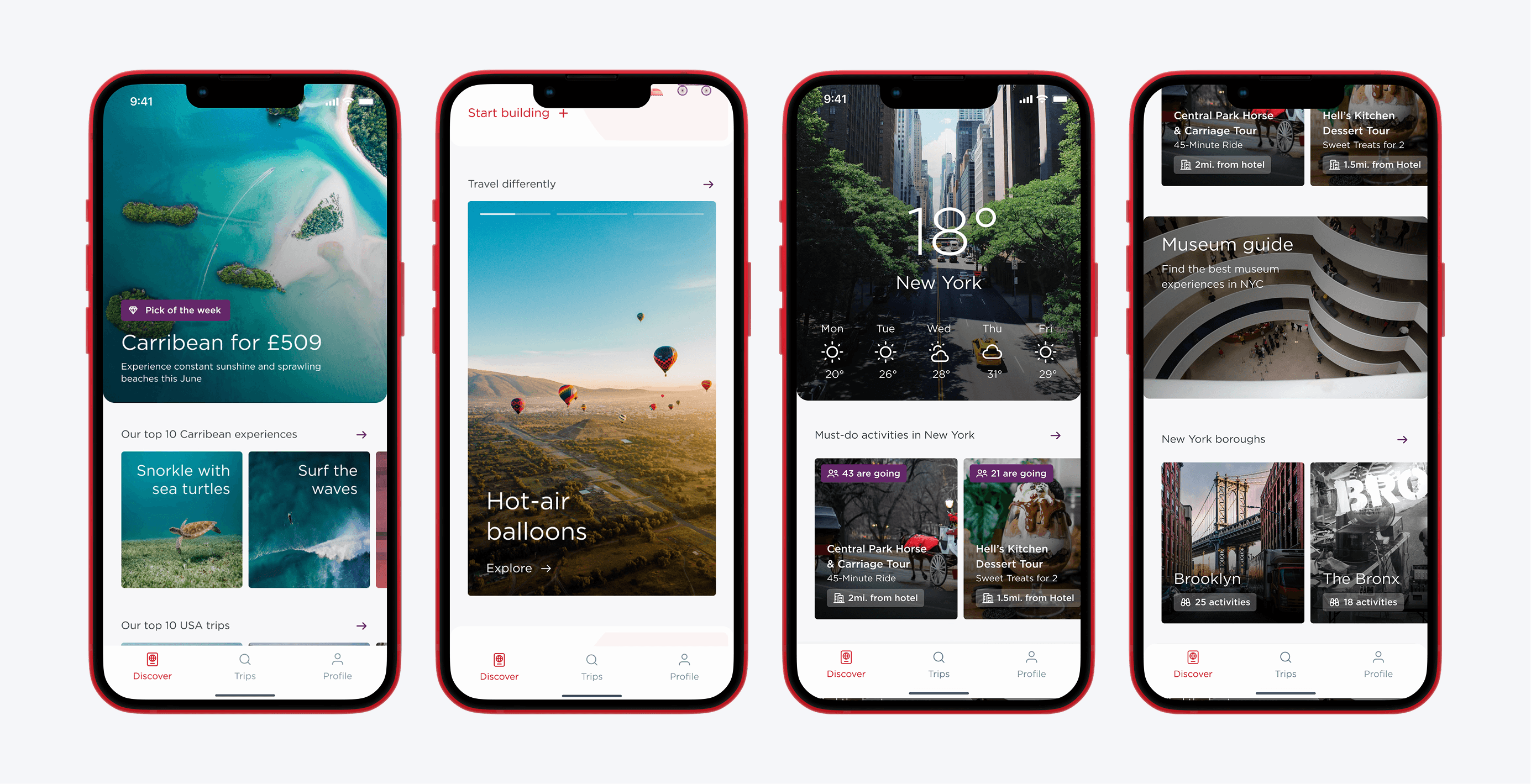
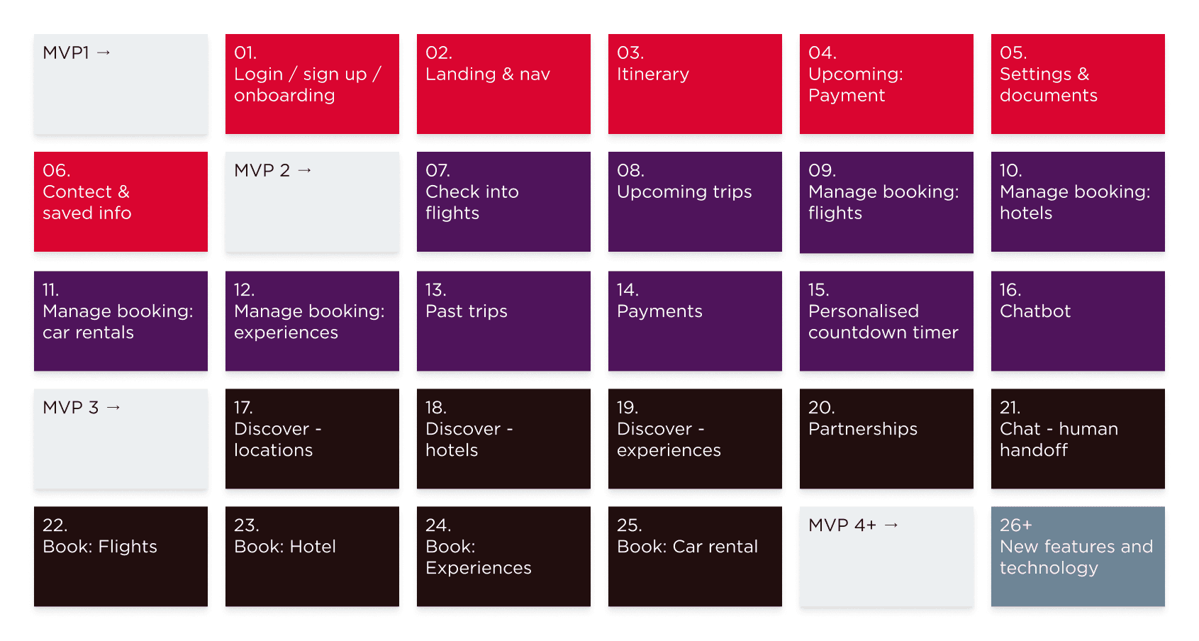
Our solution was to design the app with three distinct sections: self-service, search and book, and discover. Each section could be delivered independently without feeling incomplete, giving us a way to ship something meaningful quickly while laying the foundations for everything that followed.
MVP 1: Self-service
MVP 2: Search and book
MVP 3+: Discover and incremental updates
MVP requirements
The designs
(aka what we created to take the first step towards making Virgin Atlantic the world's most-loved travel company)
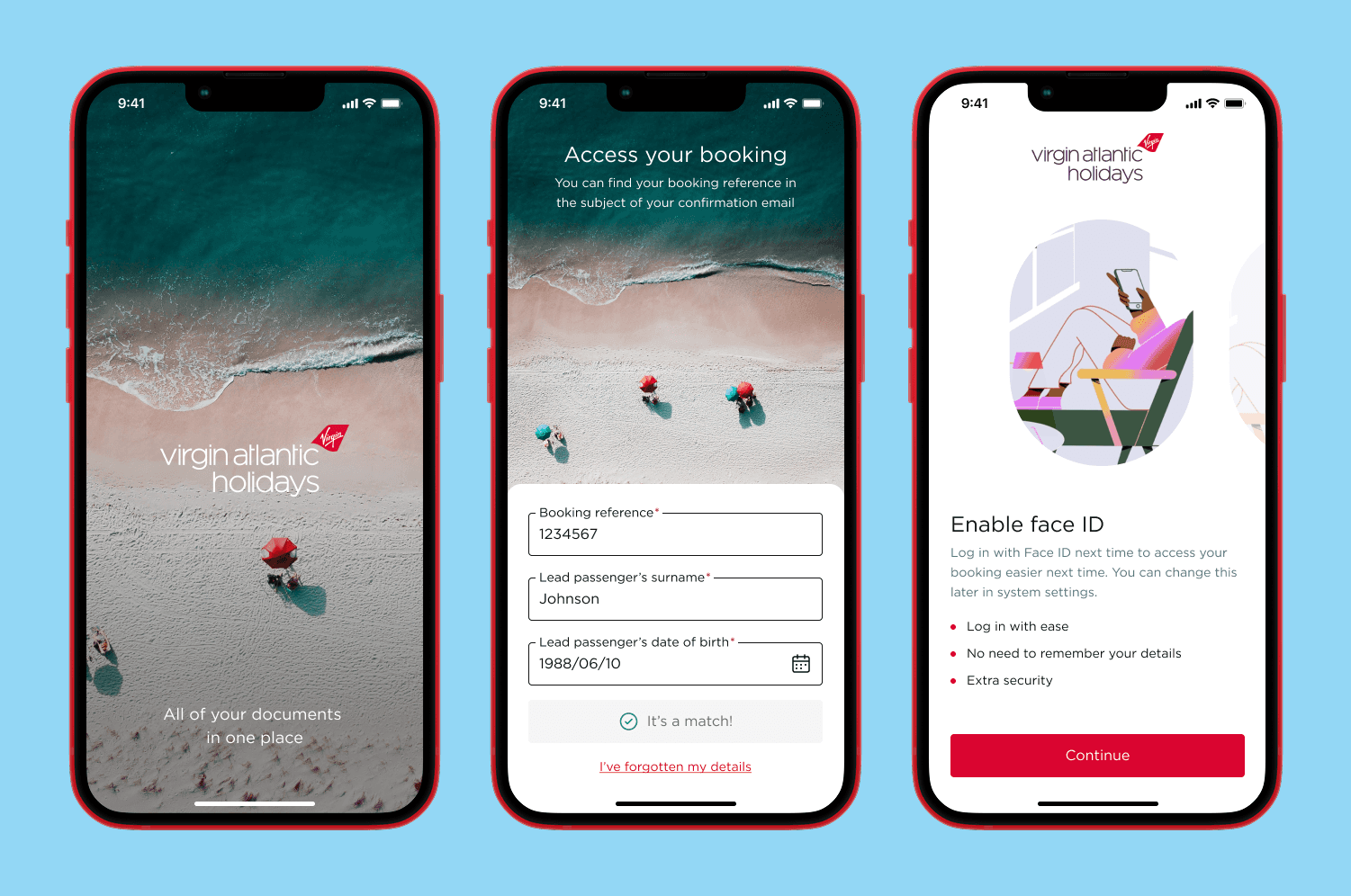
Login and onboarding
A splash screen that sets the holiday mood from the moment you open the app, a streamlined login form, and onboarding screens that introduce features like Face ID, so returning customers can skip the form entirely.
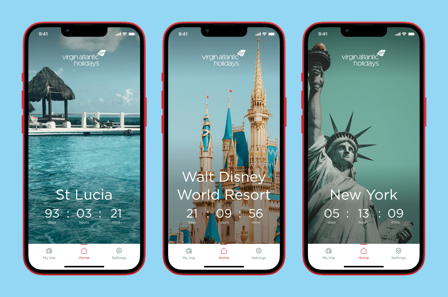
Landing screen and navigation
The landing screen greets customers with a personalised countdown to their trip, paired with editorial imagery tailored to their destination. The three-section structure introduced here carries through every future MVP.
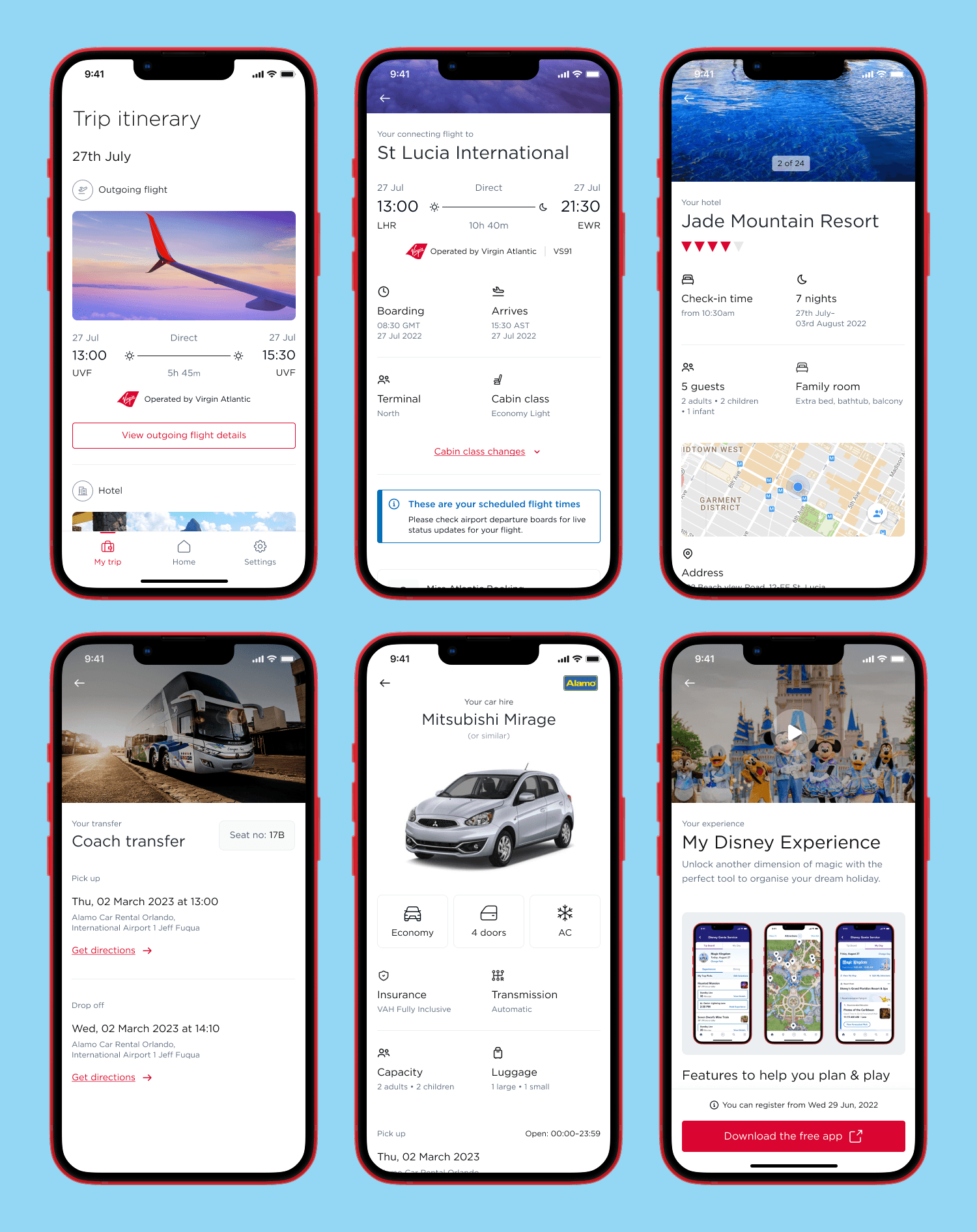
Upcoming holiday: itinerary
From flights and hotels to car hire and experiences, every detail of a customer's trip has been brought together in one place; all presented in a consistent format that's easy to scan and simple to act on.
Upcoming holiday: payments
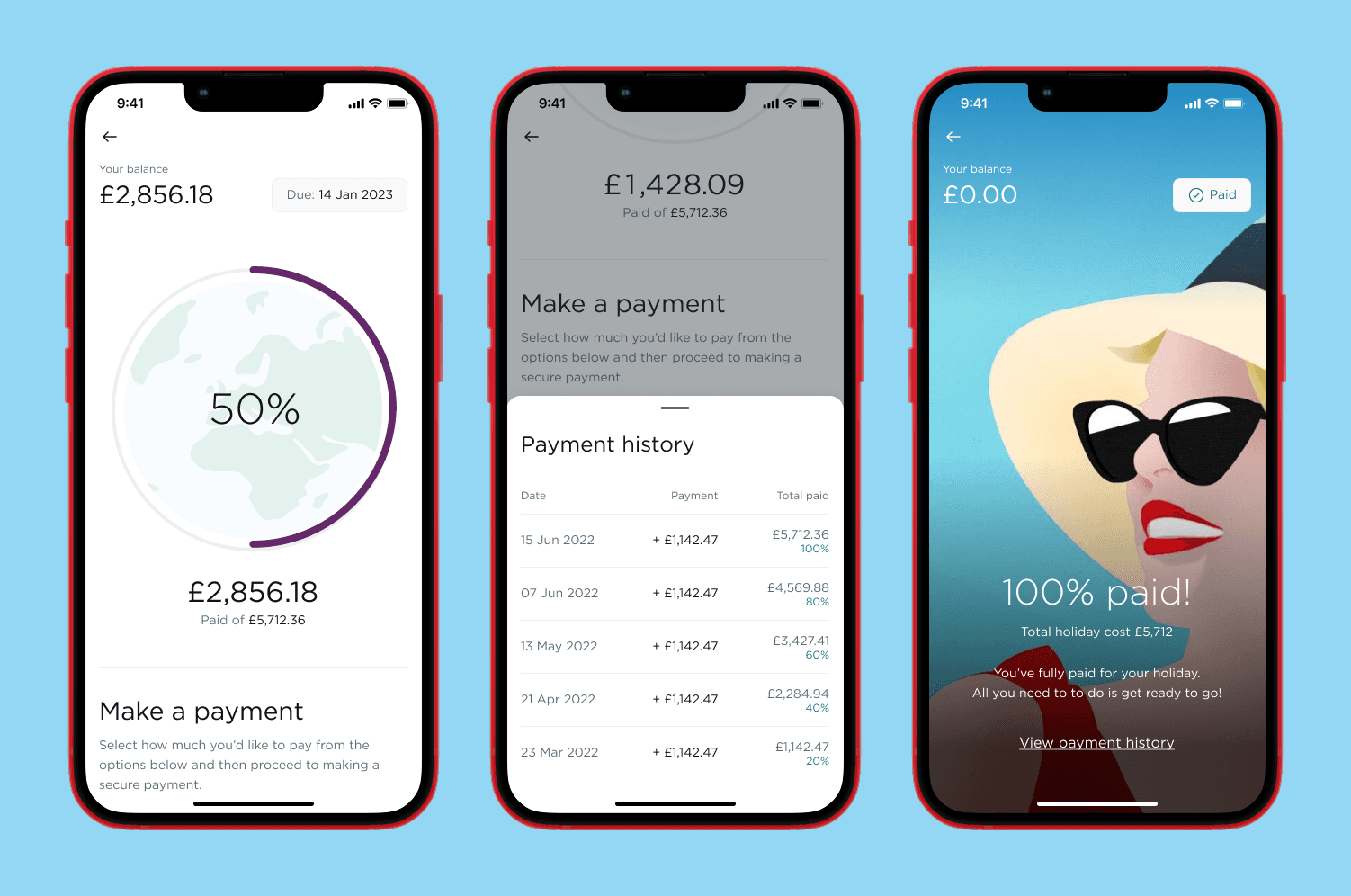
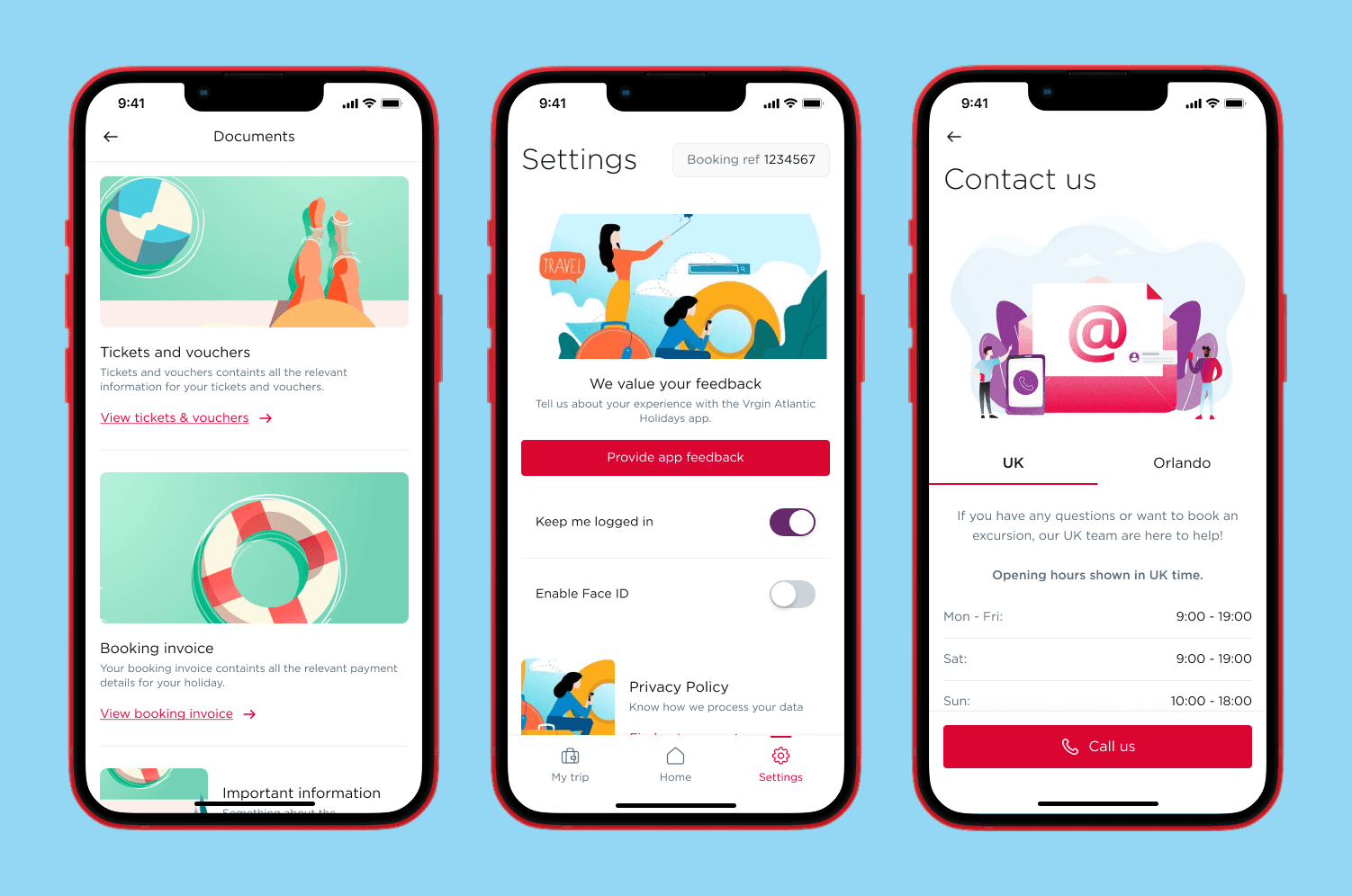
View documents, settings, and contact
Tickets, vouchers, and invoices in one place. Settings that put the customer in control. And quick access to support when needed. All wrapped up in a more engaging and intuitive design.
A crash landing…
(aka the client finally understands that they aren't ready to do this)
The insights
(aka what we learned and what we'd do differently)
Prioritise team morale over client exposure. Limit the invite list when meeting with particularly difficult and/or dismissive stakeholders.
An existing design system is an excellent tool, giving new and junior team members a structured, real-world environment to learn Figma.
Keep a paper trail, not a scorecard. Document your concerns early, raise them often, and let time do the rest.
Despite the issues, it's still possible to deliver a strong vision that inspires creative thinking around the future of air travel.
Virgin Atlantic employees get 7 free international flights per year!
The TL:DR
(aka when you're very busy or don't like long pages)
Goal: Design the first step in creating the worlds most-loved travel company by bringing Virgin Atlantic and Virgin Holidays together under one unified brand.
Problem: The existing experience was fragmented, with limited self-service, poor usability, and no brand cohesion. Internally, there was no clear roadmap, no alignment across teams, and heavy pressure to launch something within six months.
What we did: We ran immersion workshops, stakeholder interviews, competitor reviews, and ideation sessions to understand the current landscape and define a clearer direction. From that, we defined business objectives and guiding principles, and scoped a phased MVP approach that balanced immediate delivery needs with longer-term ambition.
Solution: We designed an app vision split into self-service, search and book, and discover; allowing each area to be delivered independently while still feeling part of a bigger transformation. MVP 1 included key journeys such as login and onboarding, landing and navigation, itinerary, payments, documents, settings, and contact.
Impact: Although the project ended early before launch, the team delivered a strong and credible vision for the future experience. The work helped clarify what was possible, exposed the organisational gaps blocking delivery, and gave Virgin Atlantic a clearer sense of the strategy and internal alignment they need before moving forward.
Key lessons: A strong vision alone cannot succeed without internal alignment, clear ownership, and realistic timelines. This project was a reminder that strategy and stakeholder buy-in need to be in place before delivery begins, and that even when launch is not possible, good design work can still create inspiration and momentum.